Improving Report Usability for an AI Troubleshooting Platform
Redesigned the report page to address usability gaps, restructure information architecture, and introduce approval workflows, enabling engineers to navigate and validate reports with greater clarity and confidence.
@ThirdAI Automation

Timeline
Jan. - Apr. 2025
Tools
Figma, FigJam, shadcn/ui
My Role
Leading UX designer
(Capstone Proejct)
My Responsibilities
Design System, UI Audit, Component Design, Developer Handoff, Documentation, Iteration
My manager approached me with a question:
“Can you redesign the Report Screen to improve usability and create a better user experience?”

So... if the Report screen is inefficient, it slows down the entire troubleshooting workflow and reduces trust in the platform.
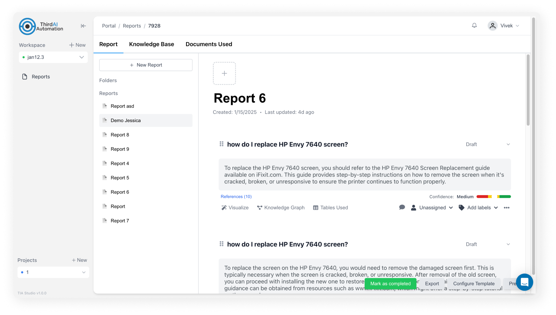
Evaluating the existing screen
My first step was to evaluate the current platform to identify usability gaps by:
- Conducted an evaluation myself to uncover usability issues in the existing design.
- Conducted quick review sessions with engineers to gather their feedback.

If we zoom in to the section displaying each query...

redesign focus & goal
My goal is to create a clearer and more trustworthy report experience that improves readability, consistency, and usability.
FOCUS 1
Improve Information Architecture & Navigation
Current Problems:
- Nested report structure
- Missing report metadata
- Related information scattered
FOCUS 2
Enhance UX Clarity & Affordance
Current Problems:
- Low affordance of clickable area
- No micro-interactions
FOCUS 3
Strengthen Visual Hierarchy & Consistency
Current Problems:
- Inconsistent colors and UI patterns
- Insufficient spacing
- Overlapping layout
Design Process
phase 1
1st Iteration: Fixing The Fundamentals

- Unify layout & alignment
→ create consistent structure across elements
- Increase spacing & whitespace
→ improve readability and reduce clutter
- Expose key report metadata
→ make status, report type, and updates immediately visible
- Strengthen affordance
→ make clickable elements more intuitive
phase 2
Twist: Expanding The Project Scope
During the design process, a new requirement came in from the manager:
“The Report screen now needs to support an approval workflow.”
This requirement shifted the project from a simple usability improvement to a little more complex challenge...
phase 3
Understanding Approval Flow
I mapped out the approval flow from these two roles‘ perspectives to understand how they overlap or diverge.

phase 4
2nd Iteration: Report Screen + Approval Flow


FINAL DESIGN
Before:
After:

IMPACT
Looking back to the overall goal I set at the beginning —
Improve readability, consistency, and usability
Positive feedback from internal design reviews
“The information was easier to navigate and understand.”
“The layout feels less crowded and the hierarchy is clearer.”
Approval flow support a more robust workflow
→ Allowed reports to be validated before publishing, increasing trust in content
Scroll to top

Improving Report Usability for an AI Troubleshooting Platform
Redesigned the report experience for an AI-driven troubleshooting platform, improving navigation, information clarity, and approval workflows to support engineers’ investigation process.
@ThirdAI Automation
Timeline
Jan. - Apr. 2025
Tools
Figma, FigJam, shadcn/ui
My Role
Leading UX designer
(Capstone Proejct)
My Responsibilities
UX Research, Solution Ideating, Wireframing, Prototyping, A/B Testings
My manager approached me with a question:

“Can you redesign the Report Screen to improve usability and create a better user experience?”
Before diving into the design, i knew i need to understand one thing first:
How Report screen matters to users and the platform?
- It’s the final output of the troubleshooting process.
- It’s where engineers document their queries, root causes and corrective actions.
- It accelerates internal collaboration and knowledge sharing.
So... if the Report screen is inefficient, it slows down the entire troubleshooting workflow and reduces trust in the platform.
Evaluating the existing screen
My first step was to evaluate the current platform to identify usability gaps by:
- Conducted an evaluation myself to uncover usability issues in the existing design.
- Conducted quick review sessions with engineers to gather their feedback.
- Conducted quick review sessions with engineers to gather their feedback.
redesign focus & goal
My goal is to create a clearer and more trustworthy report experience that improves readability, consistency, and usability.
FOCUS 1
Improve Information Architecture & Navigation
Current Problems:
- Nested report structure
- Missing report metadata
- Related information scattered
FOCUS 2
Enhance UX Clarity & Affordance
Current Problems:
- Low affordance of clickable area
- No micro-interactions
FOCUS 3
Strengthen Visual Hierarchy & Consistency
Current Problems:
- Inconsistent colors and UI patterns
- Insufficient spacing
- Overlapping layout
Design Process
phase 1
1st Iteration: Fixing The Fundamentals
- Unify layout & alignment
→ create consistent structure across elements
- Increase spacing & whitespace
→ improve readability and reduce clutter
- Expose key report metadata
→ make status, report type, and updates immediately visible
- Strengthen affordance
→ make clickable elements more intuitive
phase 2
Twist: Expanding The Project Scope
During the design process, a new requirement came in from the manager:

“The Report screen now needs to support an approval workflow.”
This requirement shifted the project from a simple usability improvement to a little more complex challenge...
phase 3
Understanding Approval Flow
I mapped out the approval flow from these two roles‘ perspectives to understand how they overlap or diverge.
phase 4
2nd Iteration: Report Screen + Approval Flow
Define & Ideation
Before:
After:
FOCUS 1
Improve Information Architecture & Navigation

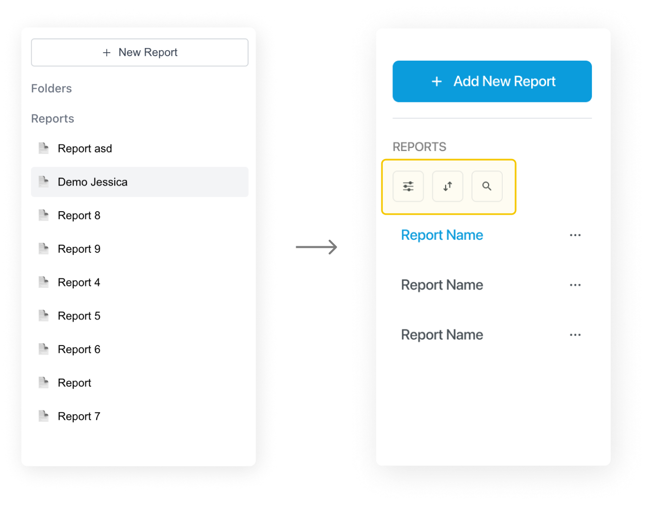
Incorporate sort/filter/search function for easier navigation

FOCUS 2
Enhance UX Clarity & Affordance


Improve affordance by adding text

FOCUS 3
Strengthen Visual Hierarchy & Consistency
Standardized UI patterns, text styles and layout

IMPACT
Looking back to the overall goal I set at the beginning —
Improve readability, consistency, and usability
Positive feedback from internal design reviews
“The information was easier to navigate and understand.”
“The layout feels less crowded and the hierarchy is clearer.”
Approval flow support a more robust workflow
→ Allowed reports to be validated before publishing, increasing trust in content
Scroll to top
Improving Report Usability for an AI Troubleshooting Platform
Redesigned the report page to address usability gaps, restructure information architecture, and introduce approval workflows, enabling engineers to navigate and validate reports with greater clarity and confidence.
@ThirdAI Automation
Timeline
Feb - Mar 2025
Tools
Figma
My Role
UX/UI Designer
My Responsibilities
UX Research, Solution Ideating, Wireframing, Prototyping, A/B Testings
My manager approached me with a question:

“Can you redesign the Report Screen to improve usability and create a better user experience?”
Before diving into the design, i knew i need to understand one thing first:
How Report screen matters to users and the platform?
- It’s the final output of the troubleshooting process.
- It’s where engineers document their queries, root causes and corrective actions.
- It accelerates internal collaboration and knowledge sharing.
So... if the Report screen is inefficient, it slows down the entire troubleshooting workflow and reduces trust in the platform.
Evaluating the existing screen
My first step was to evaluate the current platform to identify usability gaps by:
- Conducted an evaluation myself to uncover usability issues in the existing design.
- Conducted quick review sessions with engineers to gather their feedback.
If we zoom in to the section displaying each query...
redesign focus & goal
My goal is to create a clearer and more trustworthy report experience that improves readability, consistency, and usability.
FOCUS 1
Improve Information Architecture & Navigation
Current Problems:
- Nested report structure
- Missing report metadata
- Related information scattered
FOCUS 2
Enhance UX Clarity & Affordance
Current Problems:
- Low affordance of clickable area
- No micro-interactions
FOCUS 3
Strengthen Visual Hierarchy & Consistency
Current Problems:
- Inconsistent colors and UI patterns
- Insufficient spacing
- Overlapping layout
Design Process
phase 1
1st Iteration: Fixing The Fundamentals
- Unify layout & alignment
→ create consistent structure across elements
- Increase spacing & whitespace
→ improve readability and reduce clutter
- Expose key report metadata
→ make status, report type, and updates immediately visible
- Strengthen affordance
→ make clickable elements more intuitive
phase 2
Twist: Expanding The Project Scope
During the design process, a new requirement came in from the manager:

“The Report screen now needs to support an approval workflow.”
This requirement shifted the project from a simple usability improvement to a little more complex challenge...
phase 3
Understanding Approval Flow
I mapped out the approval flow from these two roles‘ perspectives to understand how they overlap or diverge.
phase 4
2nd Iteration: Report Screen + Approval Flow
FINAL DESIGN
Before:
After:
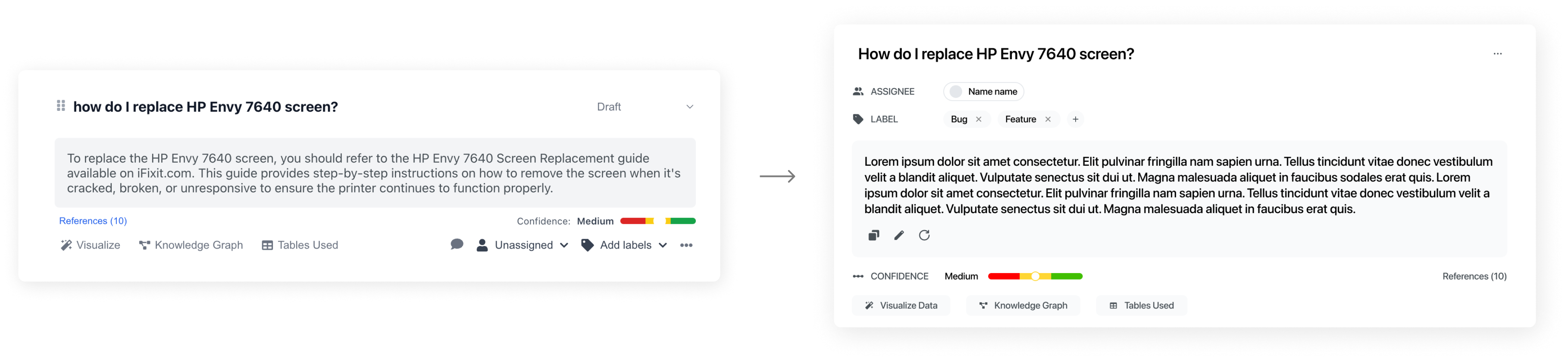
FOCUS 1
Improve Information Architecture & Navigation
Incorporate sort/filter/search function for easier navigation
FOCUS 2
Enhance UX Clarity & Affordance
Improve affordance by adding text
FOCUS 3
Strengthen Visual Hierarchy & Consistency
Standardized UI patterns, text styles and layout
IMPACT
Looking back to the overall goal I set at the beginning —
Improve readability, consistency, and usability
Positive feedback from internal design reviews
“The information was easier to navigate and understand.”
“The layout feels less crowded and the hierarchy is clearer.”
Approval flow support a more robust workflow
→ Allowed reports to be validated before publishing, increasing trust in content
Scroll to top
