Redesigning the landing page of ThirdAI Automation
An all-in-one platform that streamlined the fragmented copy trading workflows,
brings together brings together real-time trader communication and tailored trading bots.
@Crypto-Arsenal
Timeline
Aug. - Sep. 25
Tools
Framer, Figma
My Role
Leading UX designer
with co-founder
My Responsibilities
UX Research, Solution Ideating, Wireframing, Prototyping, Design System, User Testing
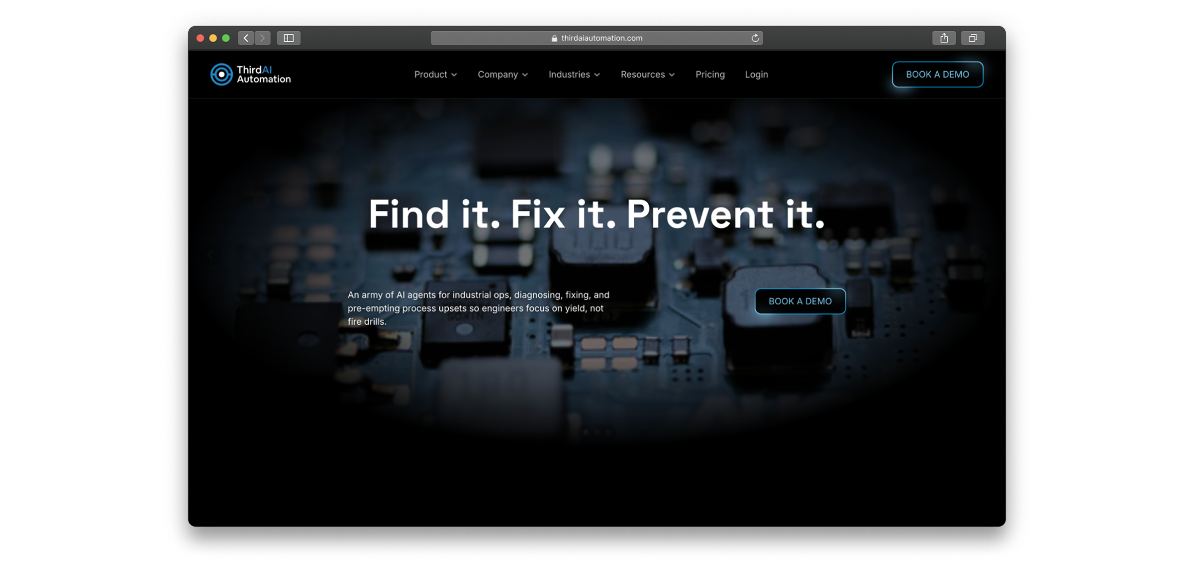
When I first joined ThirdAI Automation, I noticed something right away:
Our website didn’t feel like us!
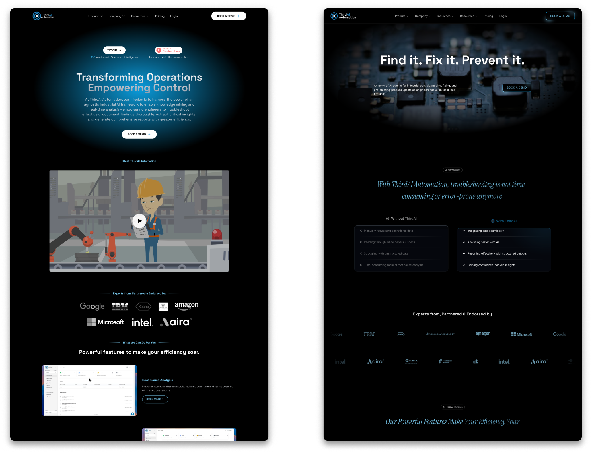
We’re an industrial AI company building tools for engineers in manufacturing and semiconductors. But the old site looked more like a generic tech demo, and it certainly didn’t convey the feeling of a company bridging the rigor of industry with the creativity of AI.
That gap between who we were and how we showed up online became the starting point for this redesign.
- A more engaging trading experience
- Offers more customization and flexibility
Why the old website wasn’t working?
👀
Visual Identity
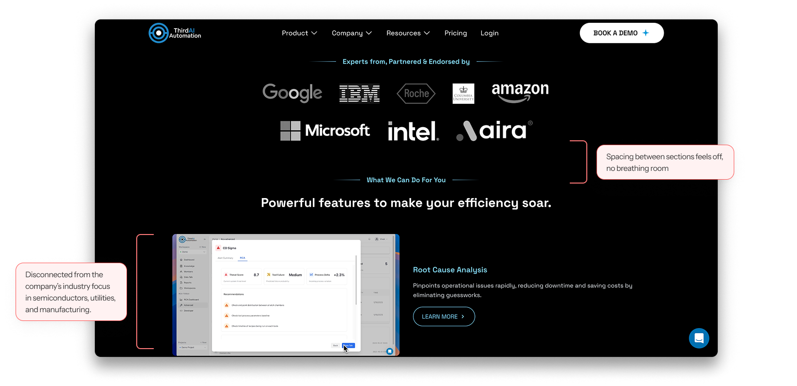
- Didn’t convey an industrial and AI-driven identity
- Disconnected from the company’s industry focus in semiconductors, manufacturing, utilities, etc.
✏️
UI & Layout
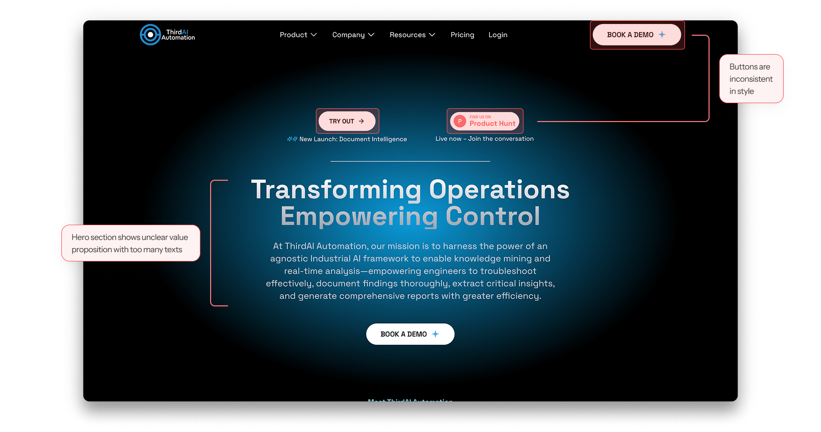
- Inconsistent and not reusable UI components, especially the buttons
- Weak hierarchy
- Cluttered spacing between sections
📖
Content
- Unclear value proposition and what the company does
- No stats or metrics that shows company’s impact
- No user journey, didn’t guide users from awareness → trust-building → conversion
At its core, the website wasn’t helping us build trust or drive conversions. That meant the problem went beyond design — it was directly impacting the business.
So i frame the goal as...
However, we noticed that — not all users have expertise or time to monitor and fine-tune their trading bots.
However, we noticed that — not all users have expertise or time to monitor and fine-tune their trading bots.
- Usability → make the page easy to navigate, highlight value clearly, and strengthen information hierarchy.
However, we noticed that — not all users have expertise or time to monitor and fine-tune their trading bots.
My Approach
However, we noticed that — not all users have expertise or time to monitor and fine-tune their trading bots.
Engineer-coded
✅ Maximum flexibility, fully customized
❌ Long timeline, engineer-dependent, hard for marketing updates
Webflow
✅ Strong SEO, scalable structure
❌ Steeper learning curve, harder for non-technical team, slower iteration
Framer
✅ Designers can publish directly, faster iteration with lower engineering cost
❌ SEO weaker than Webflow, limited for highly complex customizations
We chose Framer because it balanced agility, design freedom, and business scalability.
Most importantly, it allowed us to launch quickly — aligning with the co-founder’s priority to get the new site live fast, while still setting up a scalable foundation for future updates.
User Flow 1
Lead traders publish a strategy to their store.
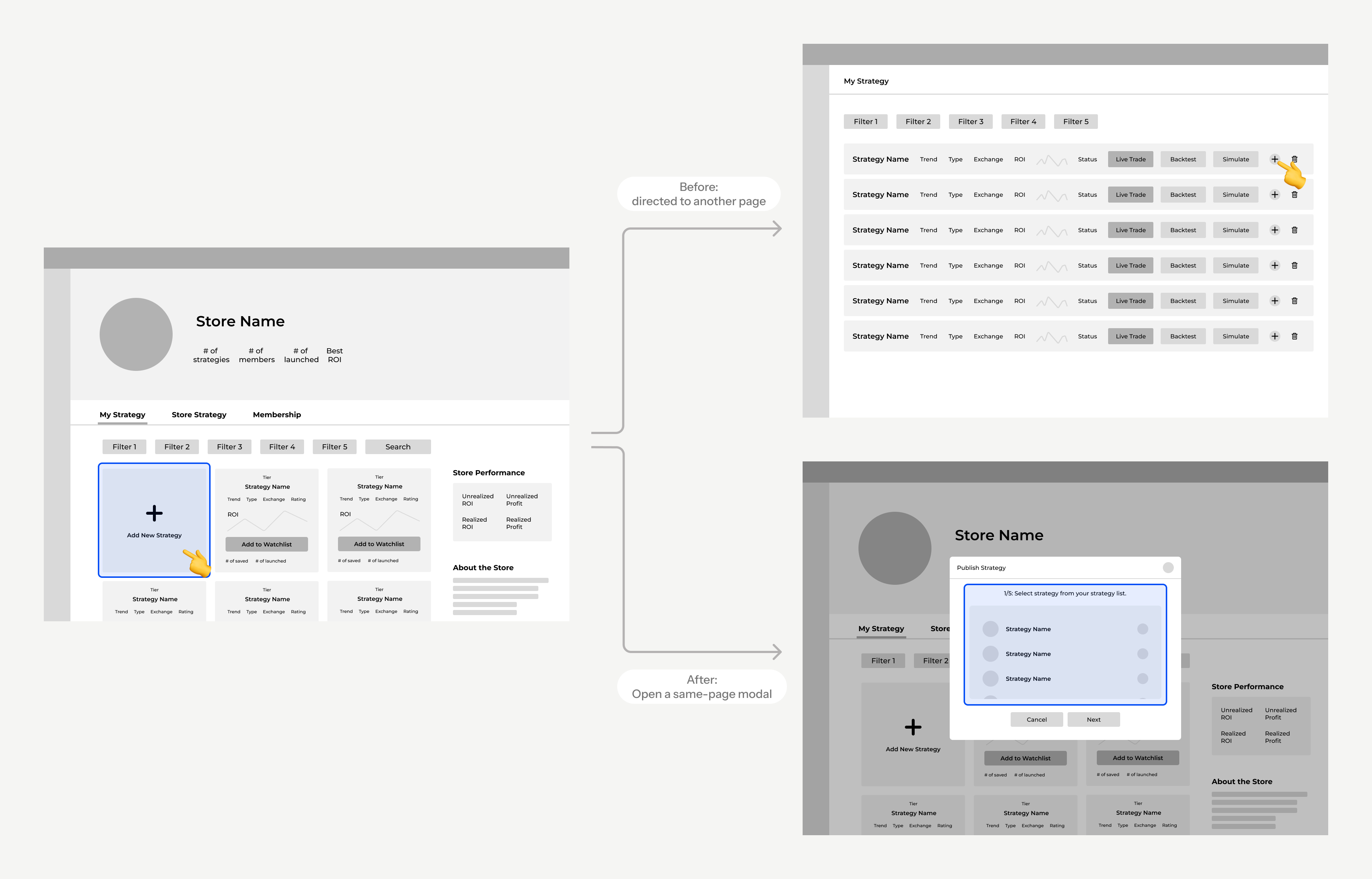
In the original flow, when users wanted to publish a strategy to the store, they had to first navigate to a separate page that listed all of their strategies and then select the one they wanted to publish.
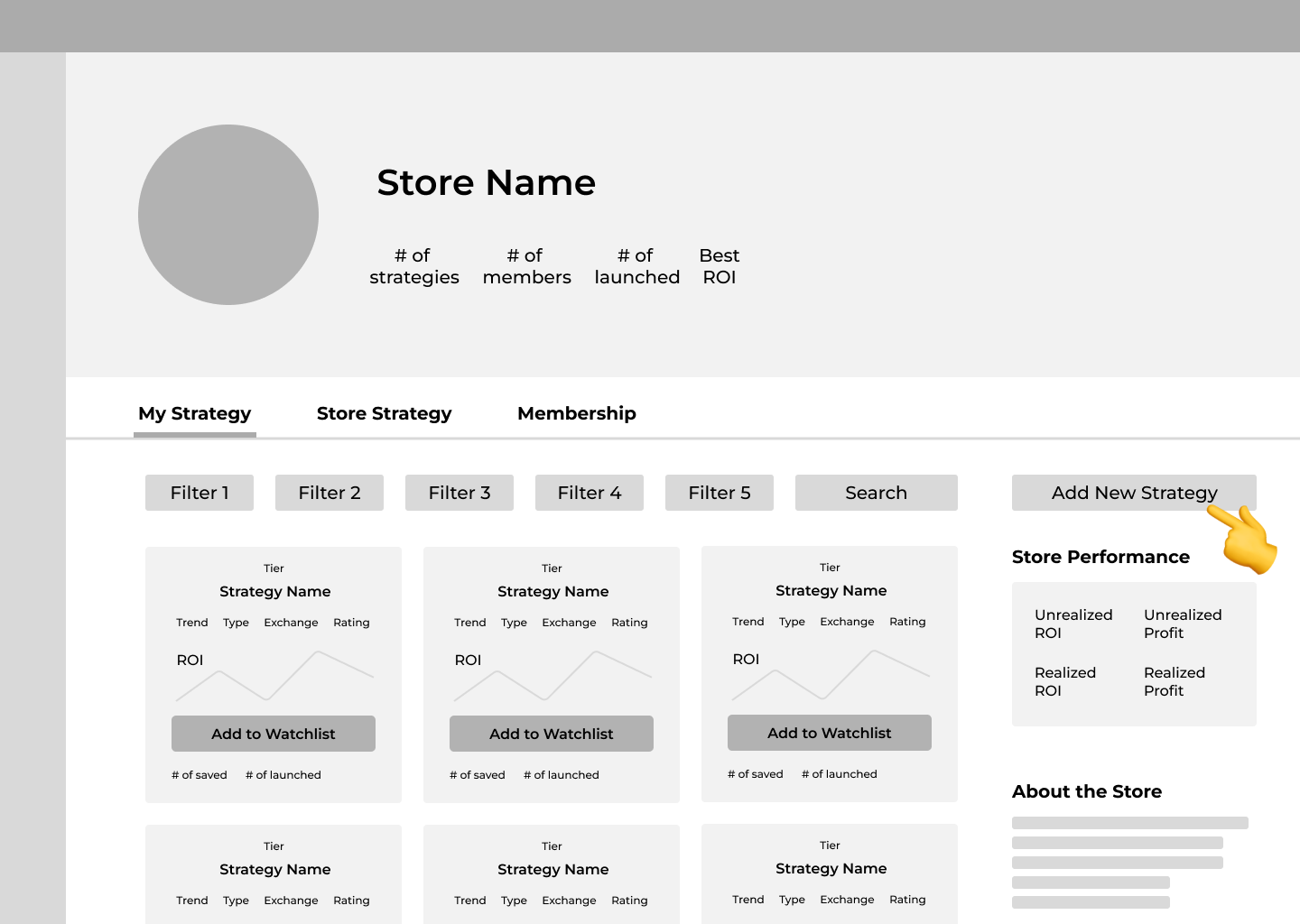
1/7: Select "Add New Strategy" button
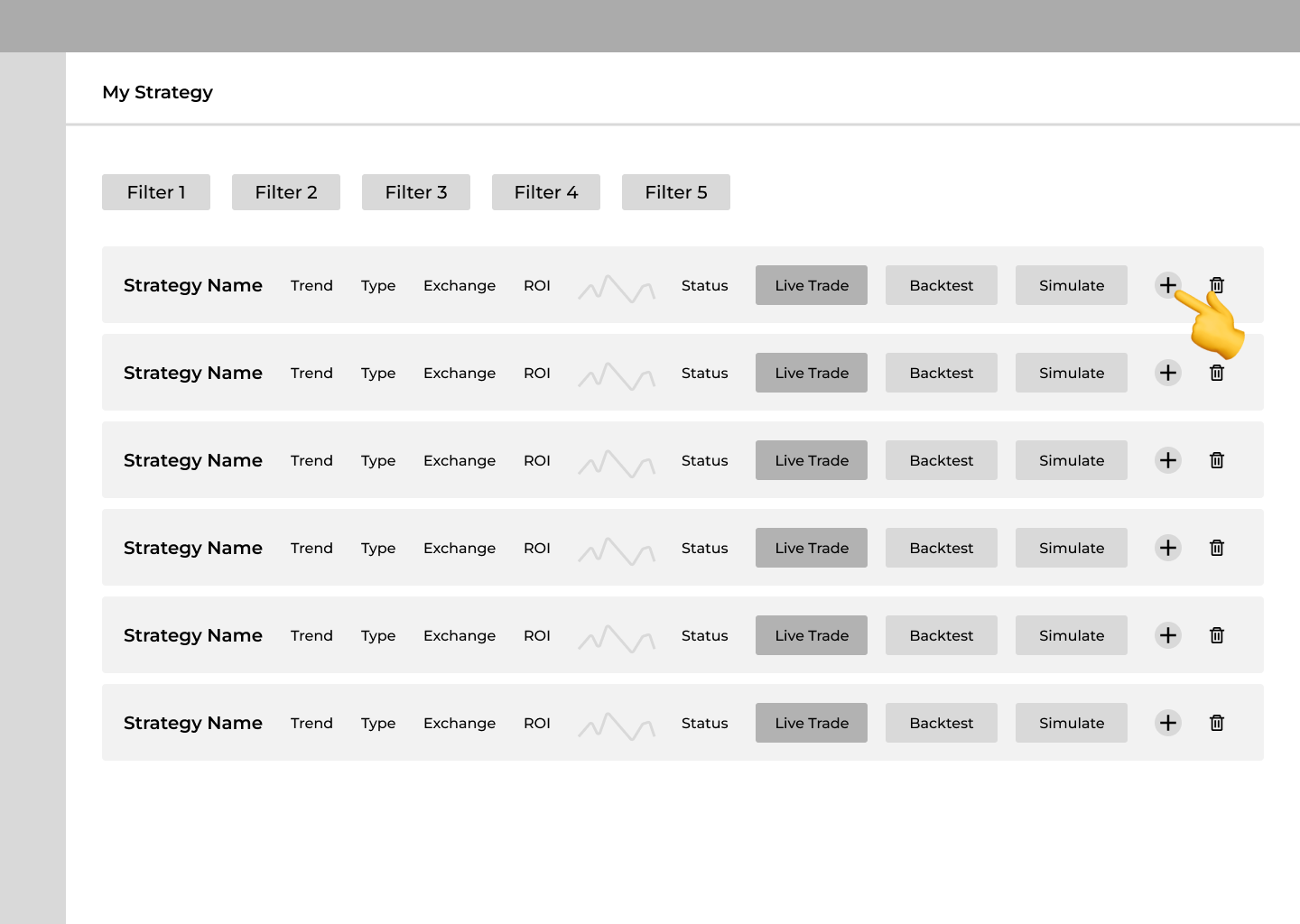
2/7: Select "Add" to publish the strategy
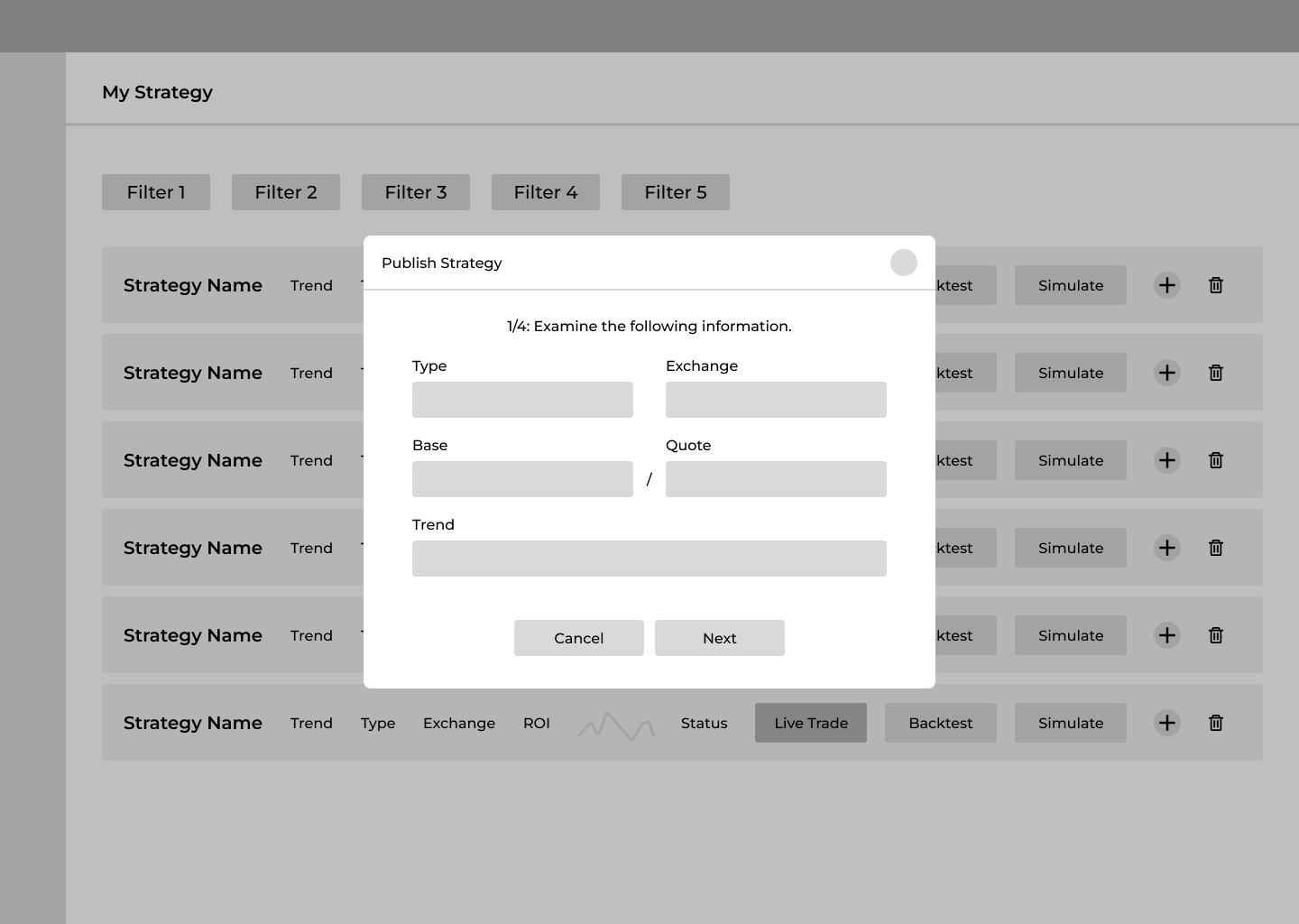
3/7: Fill in the strategy basic settings
4/7: Fill in the investment-related settings
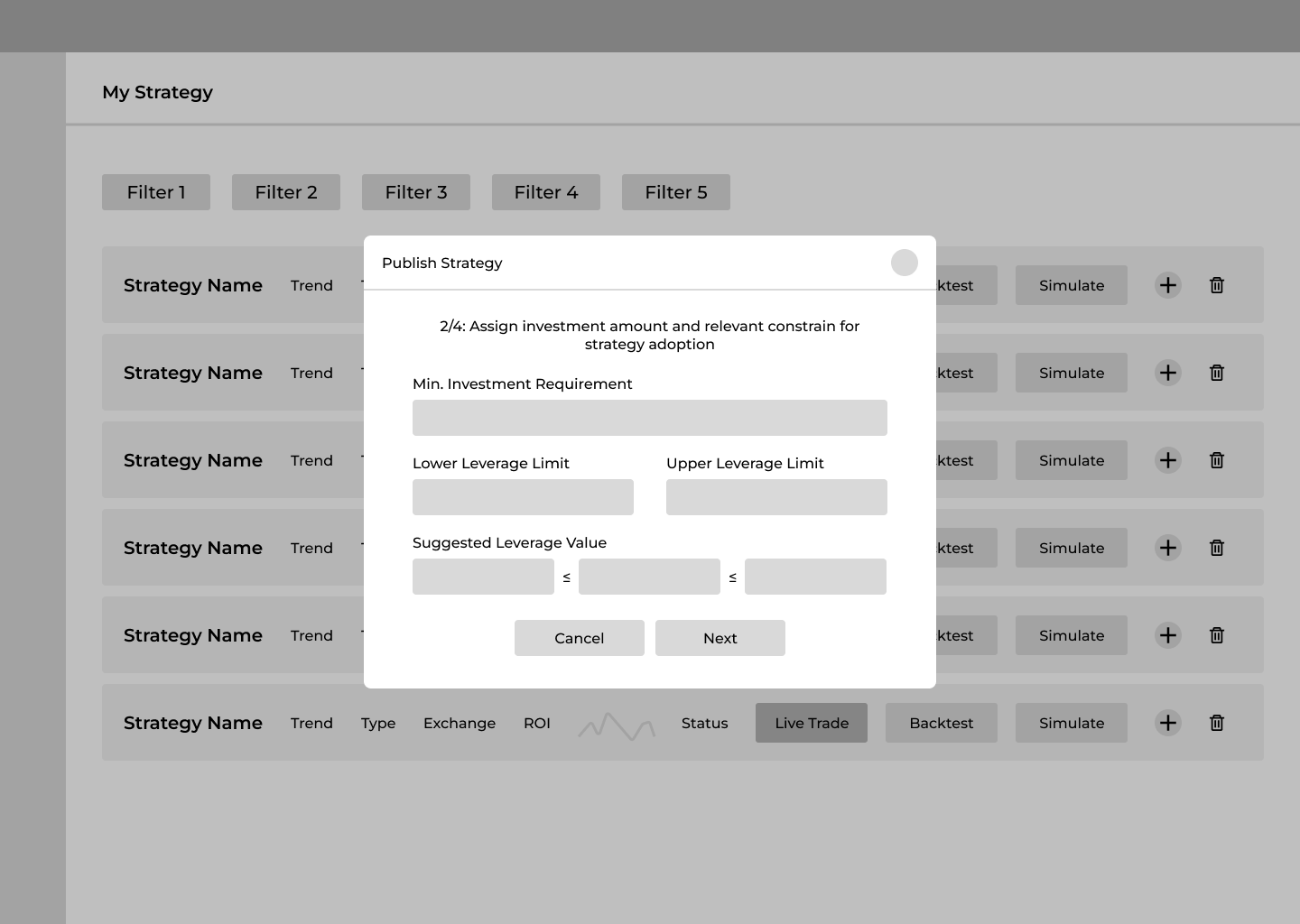
5/7: Fill in the profit-related settings
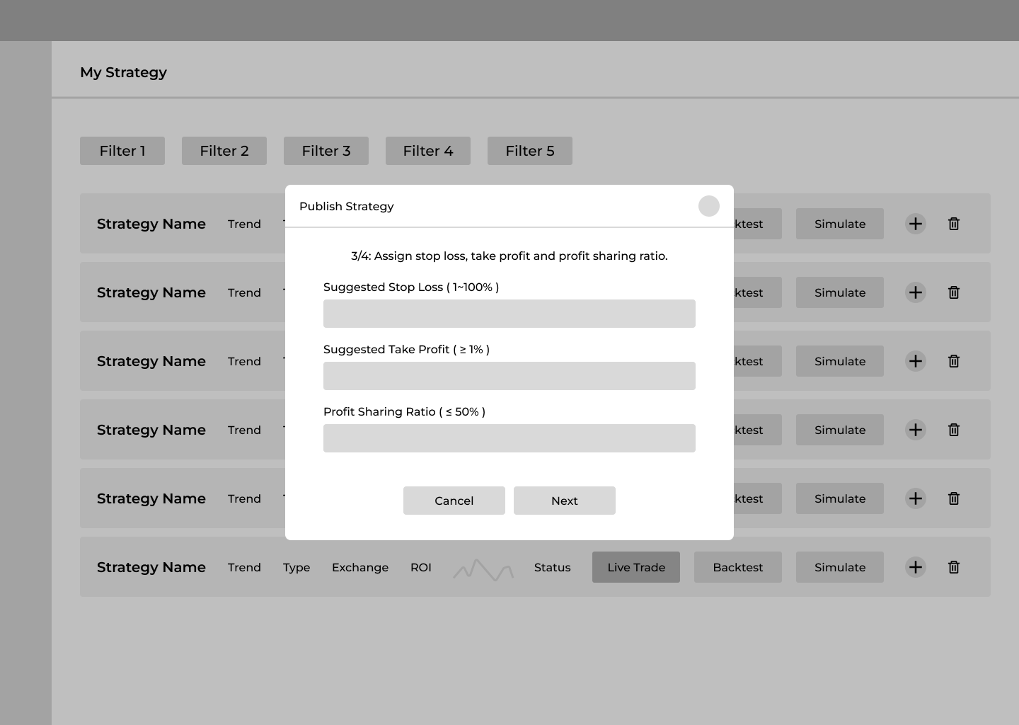
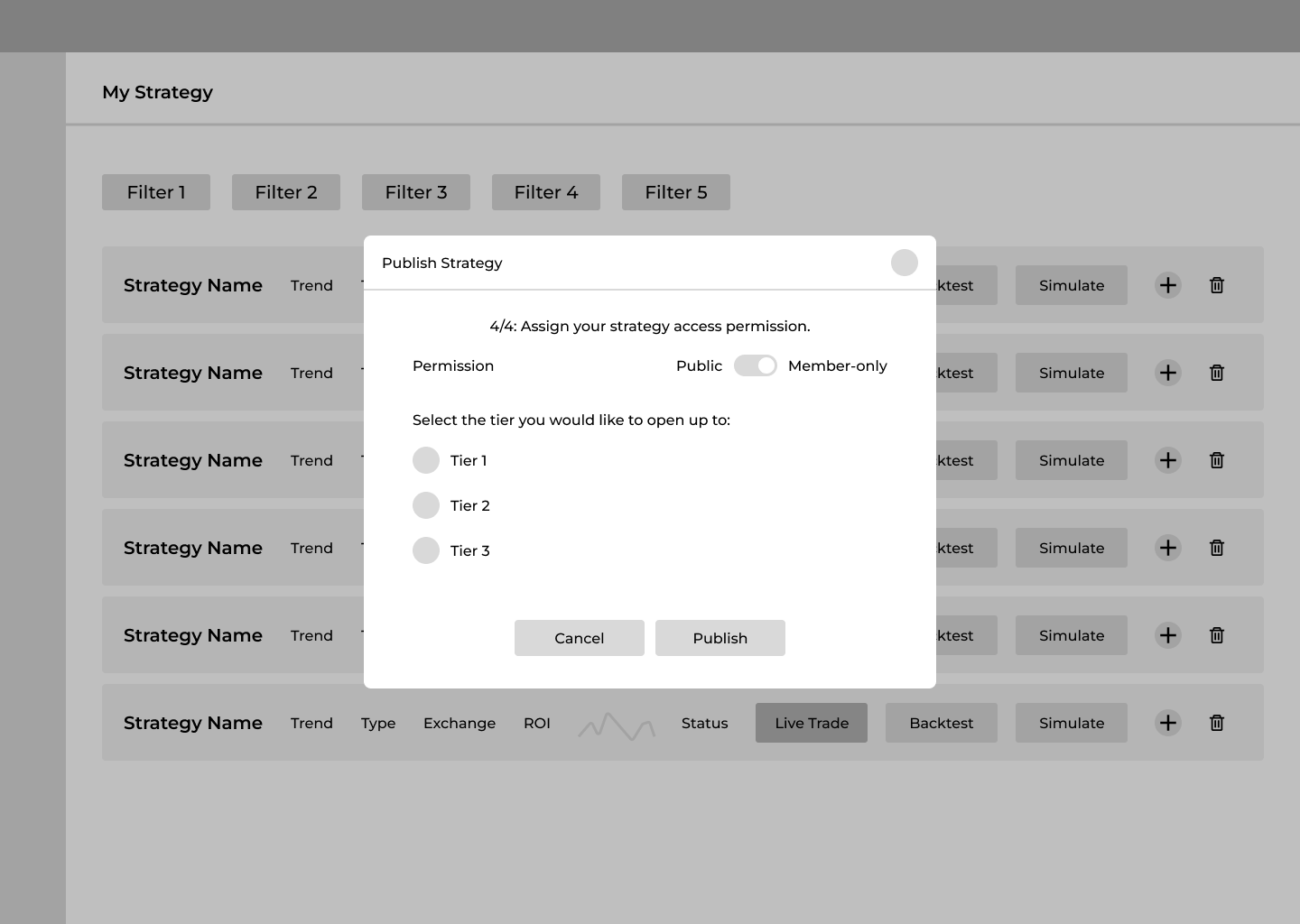
6/7: Set up the strategy access permission
7/7: Publish successfully!
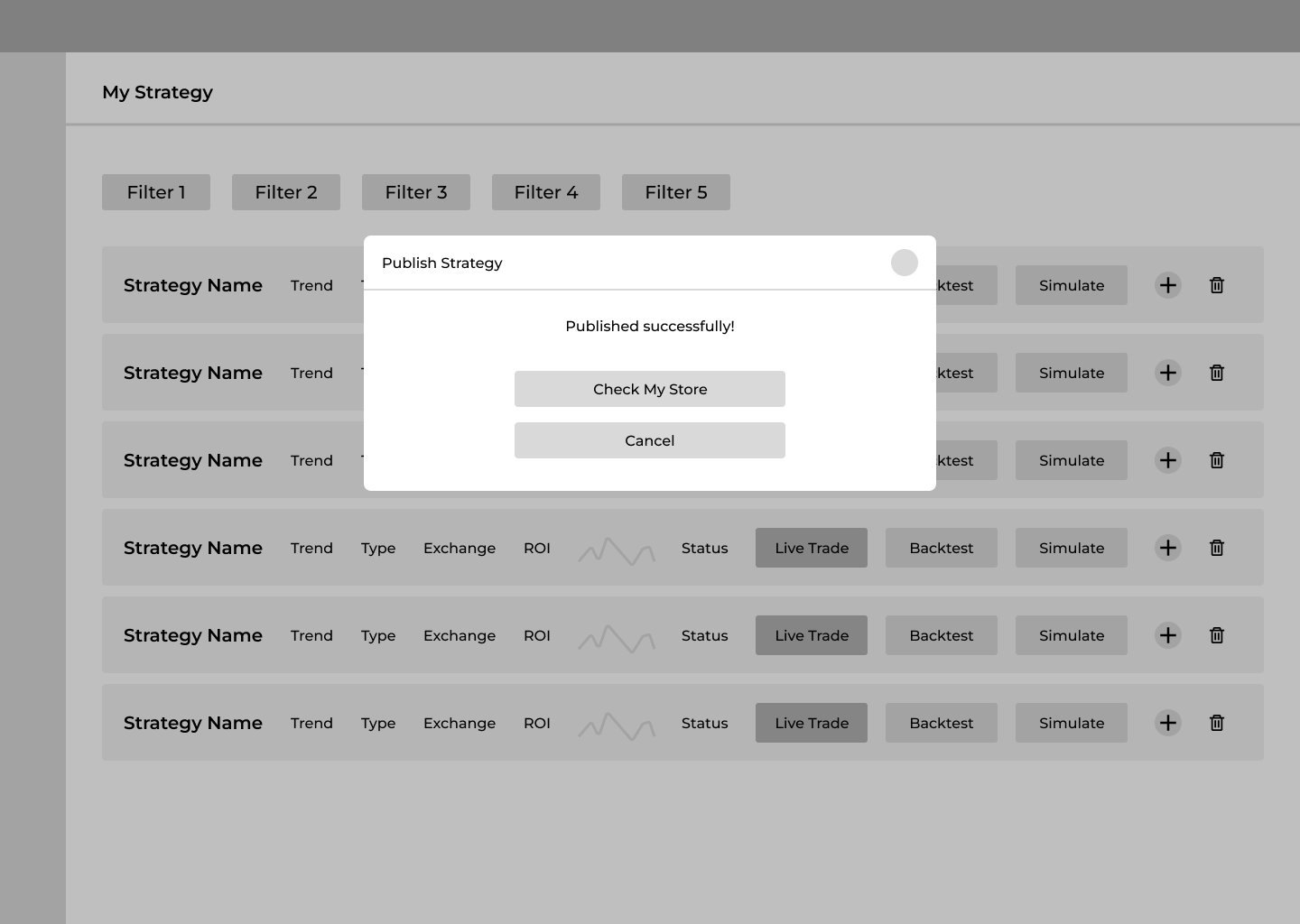
During user testing, we found that the process of navigating to separate page disrupted the user experience, and the page switch caused unnecessary confusion.
So I redesigned the flow to allow users to complete the entire process directly on the store page.
User Flow 2
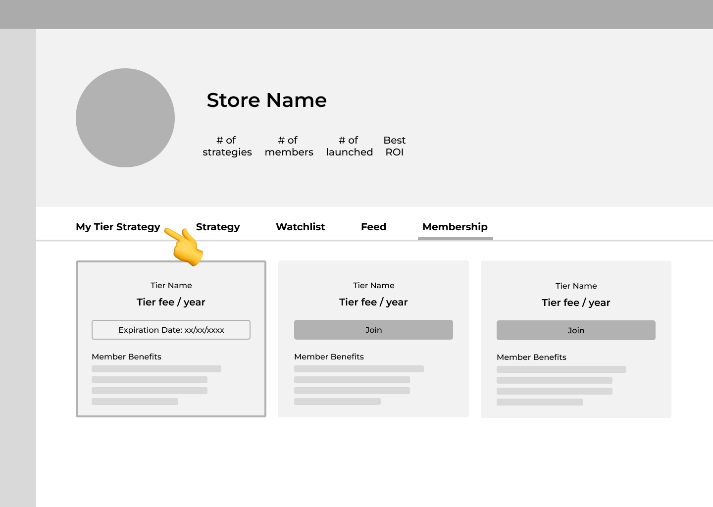
Traders select a lead trader’s store and join the membership.
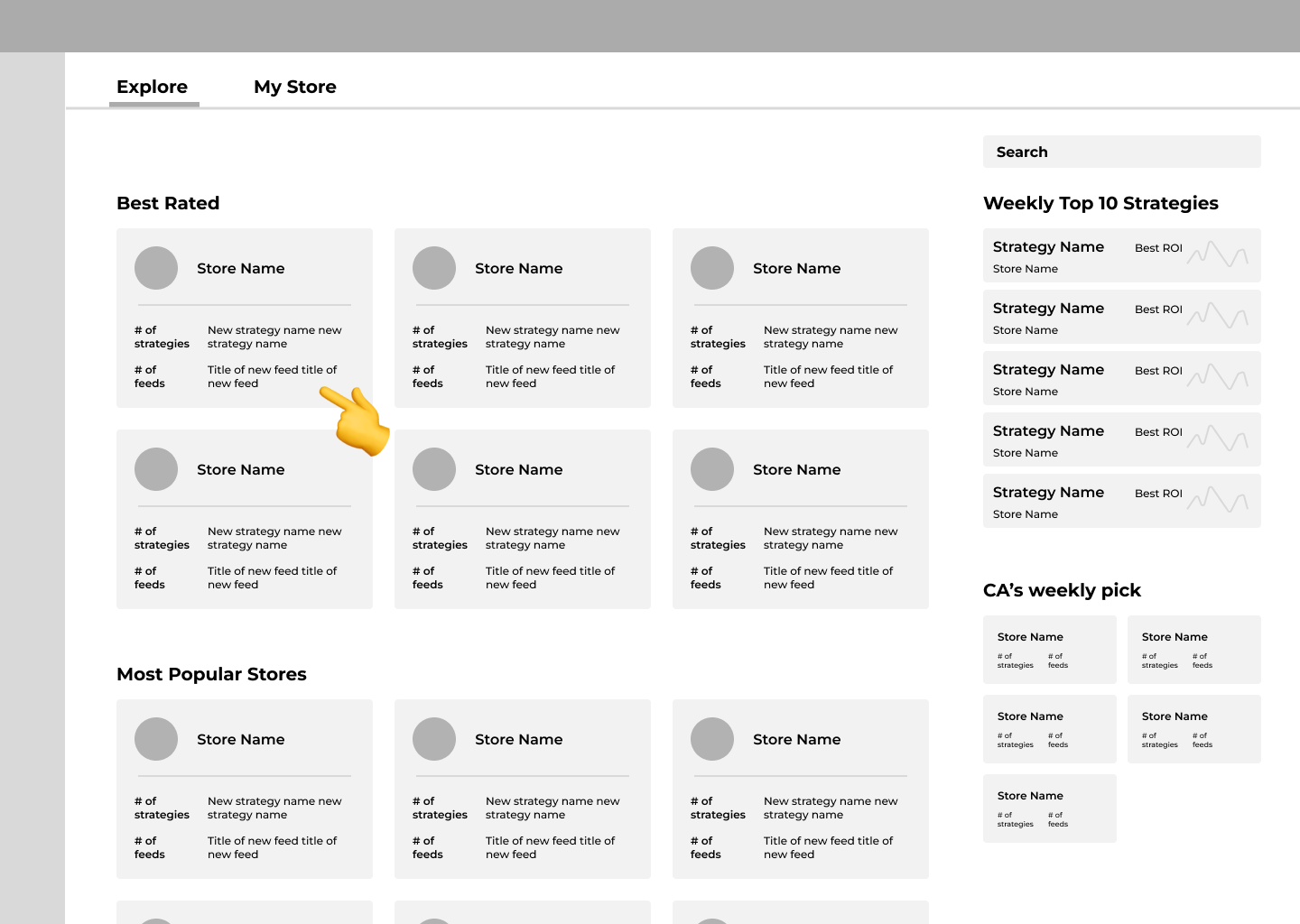
1/5: Select a store
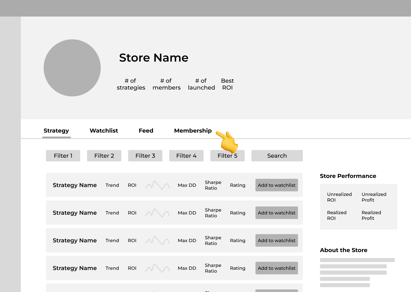
2/5: Navigate to "Membership" page
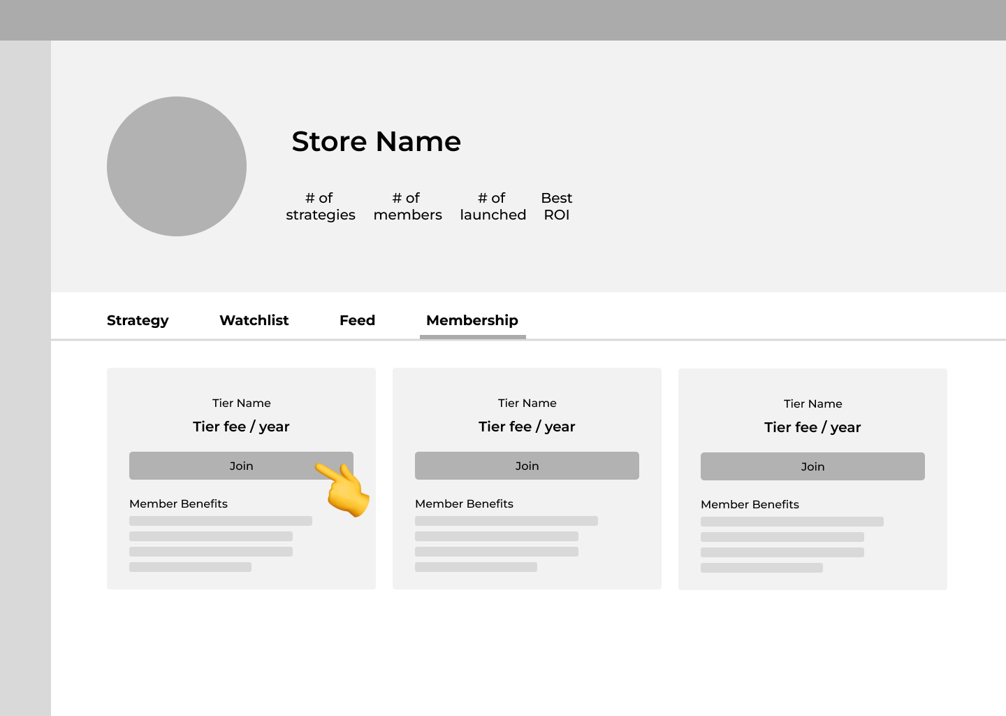
3/5: Select a membership tier
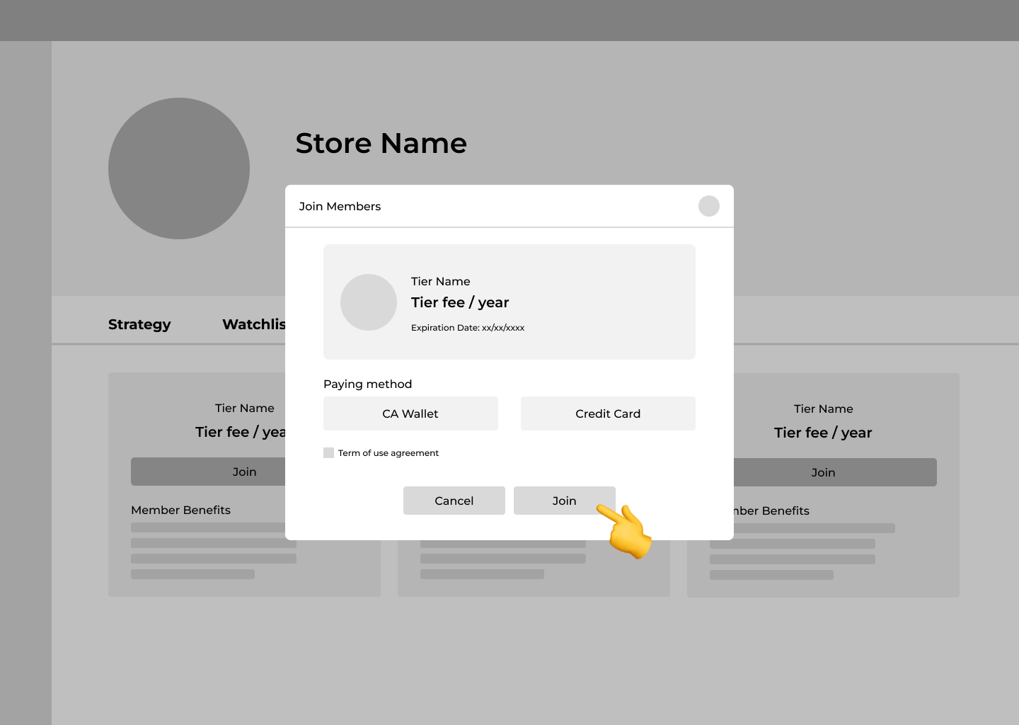
4/5: Confirm & Join membership
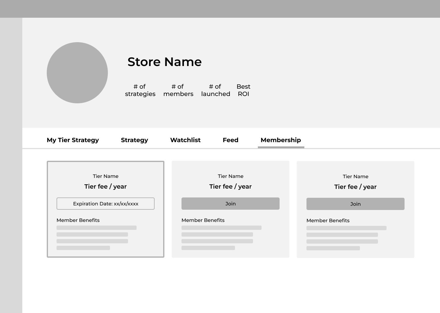
5/5: Join successfully
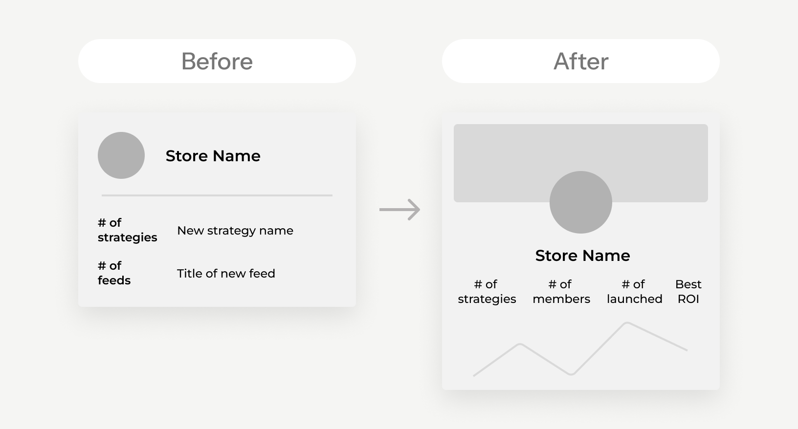
Based on feedback from internal design reviews, I refined the store card layout to highlight key performance metrics.
I prioritized data-driven information for clearer store performance, making better use of limited card space.
User Flow 3
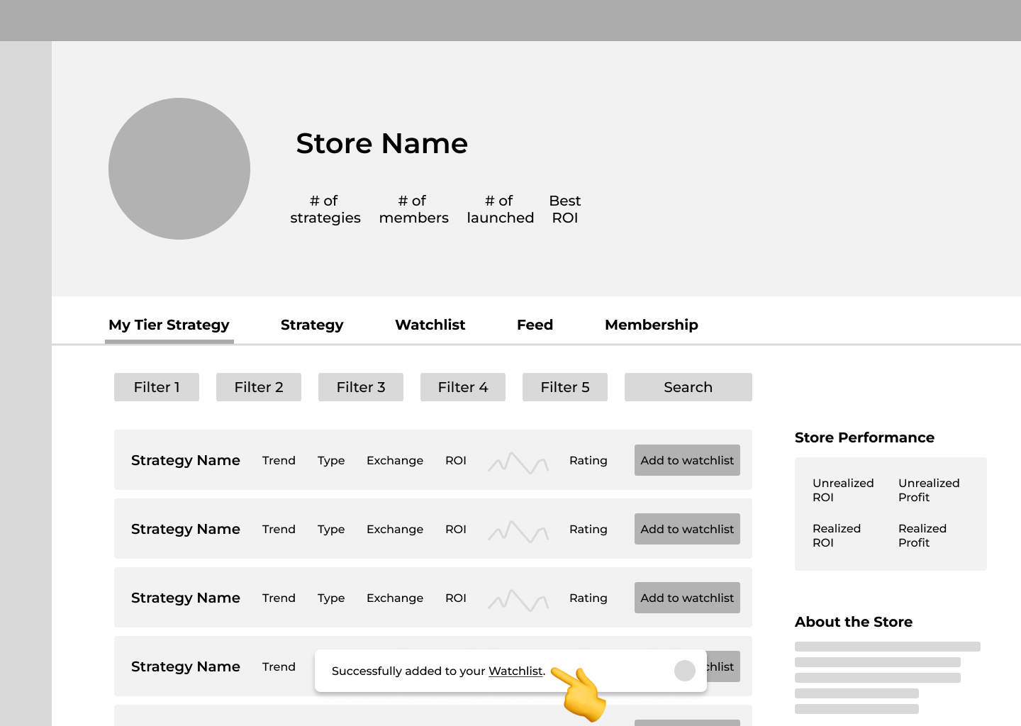
After joining the membership, traders select a strategy, add it to their watchlist, and trade.
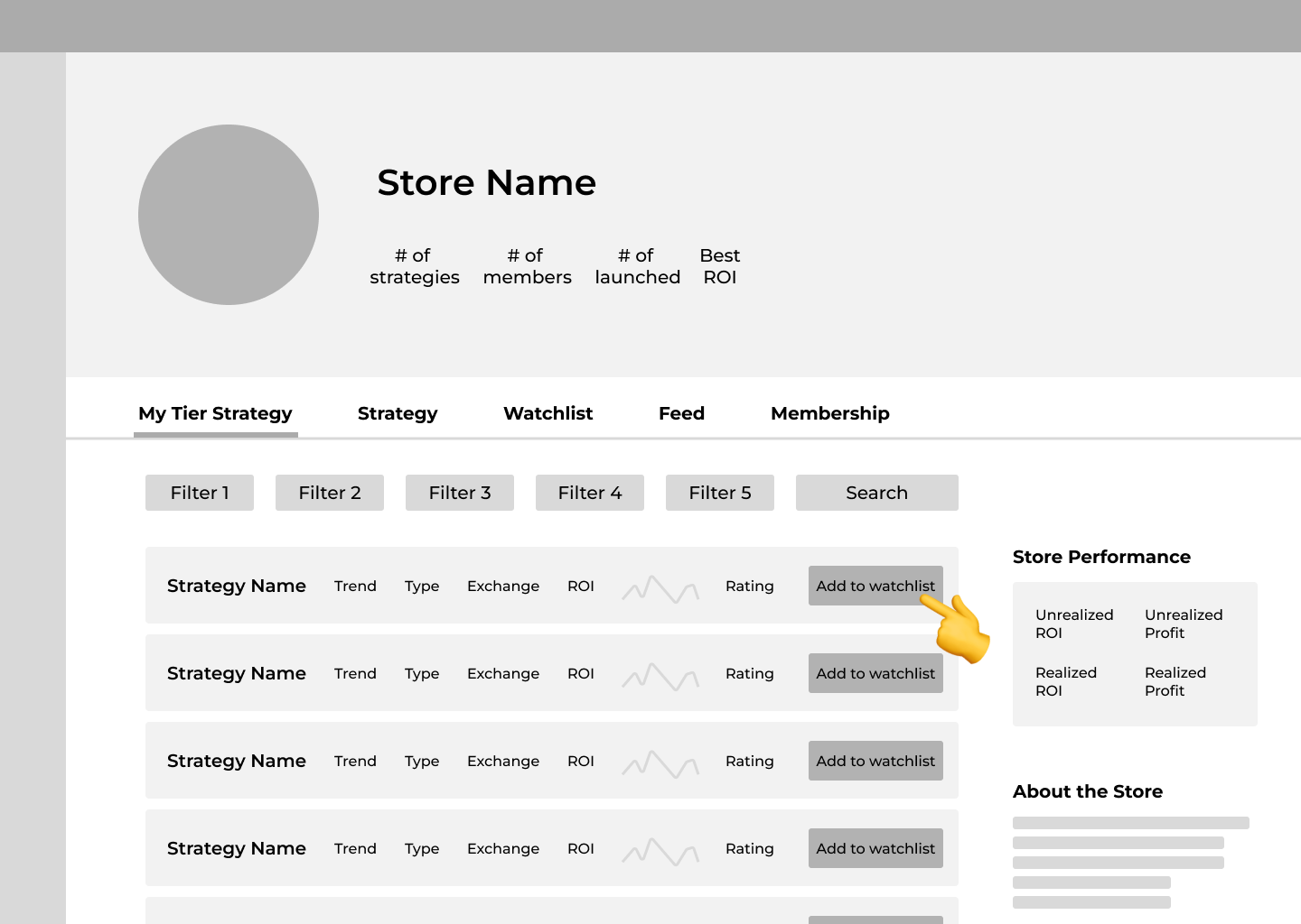
1/4: Navigate to "My Tier Strategy" page
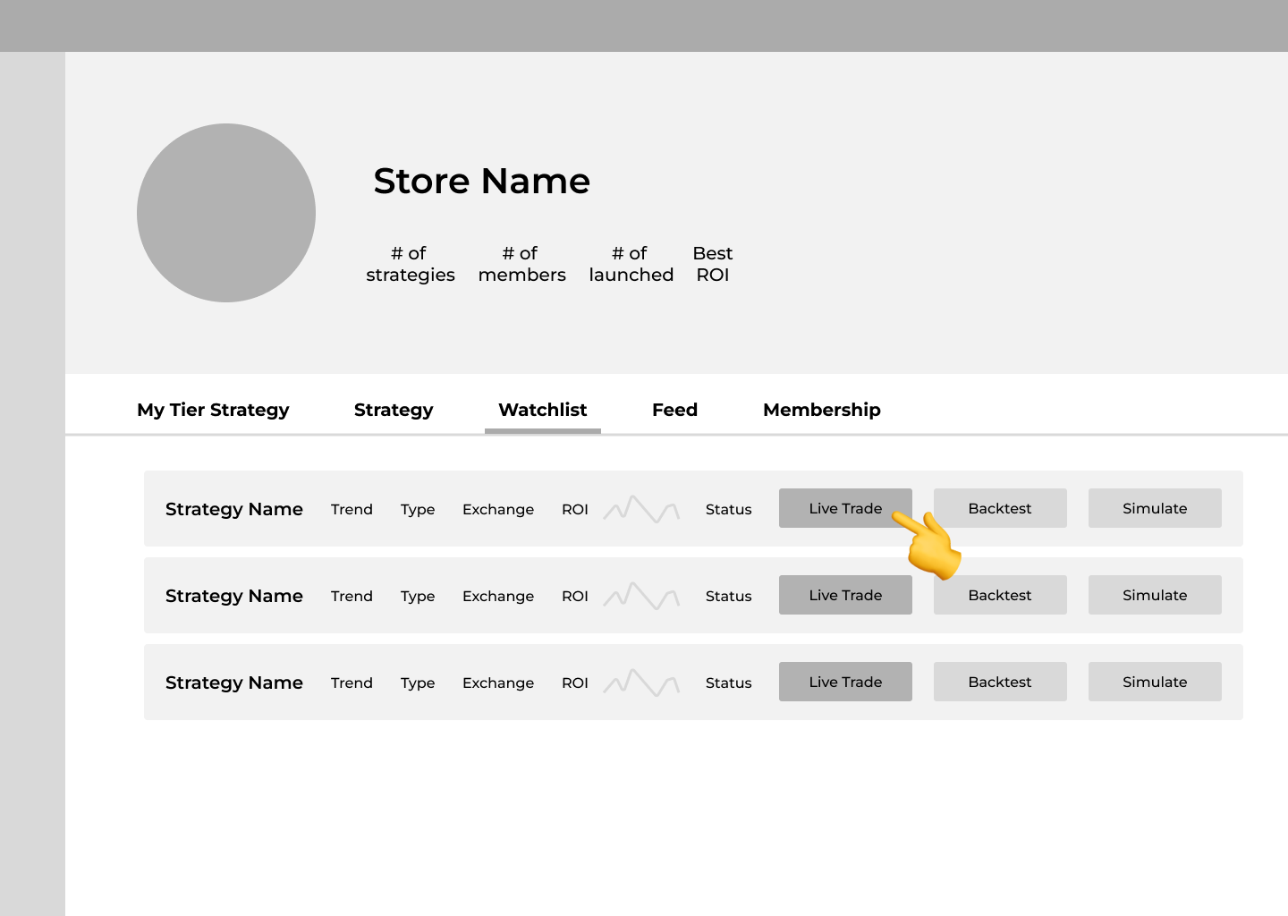
2/4: Add strategy into watchlist
3/4: Navigate to "Watchlist" page
4/4: Live trade with the strategy
To create a more cohesive experience, I aligned the strategy layout with the updated store card design.
I switched to a vertical layout to enhance readability and emphasize the CTA button “Add to watchlist”, making key information more accessible.

Final Designs
Homepage
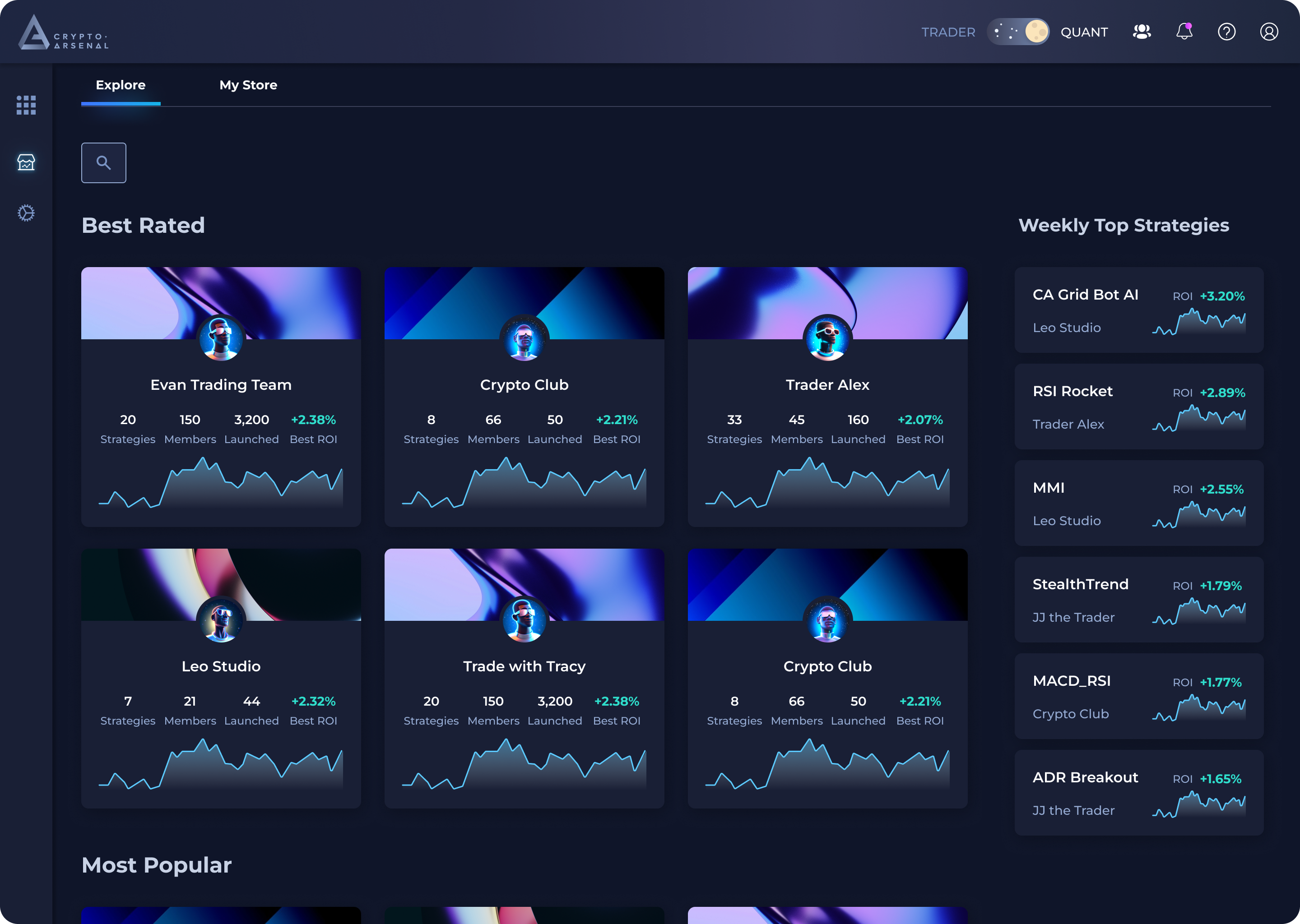
Store Detail Screens
Strategy Publishing Screens
Impact
🎉 The platform’s launch successfully attracted 10 strategy teams and 40+ daily traders in its first week, and boosted user engagement by 30% within its first month.
My Takeaways
- Balance between the limitations of resources and the deliverables.
- Communicate with cross-functional partners timely and think from different perspectives, e.g. consider the technical constraints, create clear design specs.
- Always keep users’ problems and goal in mind while looking for solutions and designing.
Scroll to top
Redesigning the landing page of ThirdAI Automation
An all-in-one platform that streamlined the fragmented copy trading workflows,
brings together brings together real-time trader communication and tailored trading bots.
@Crypto-Arsenal

Timeline
Aug. - Sep. 25
Tools
Framer, Figma
My Role
Leading UX designer
with co-founder
My Responsibilities
UX Research, Solution Ideating, Wireframing, Prototyping, Design System, User Testing
When I first joined ThirdAI Automation, I noticed something right away:
Our website didn’t feel like us!
We’re an industrial AI company building tools for engineers in manufacturing and semiconductors. But the old site looked more like a generic tech demo, and it certainly didn’t convey the feeling of a company bridging the rigor of industry with the creativity of AI.
That gap between who we were and how we showed up online became the starting point for this redesign.

- A more engaging trading experience
- Offers more customization and flexibility
Why the old website wasn’t working?


👀
Visual Identity
- Didn’t convey an industrial and AI-driven identity
- Disconnected from the company’s industry focus in semiconductors, manufacturing, utilities, etc.
✏️
UI & Layout
- Inconsistent and not reusable UI components, especially the buttons
- Weak hierarchy
- Cluttered spacing between sections
📖
Content
- Unclear value proposition and what the company does
- No stats or metrics that shows company’s impact
- No user journey, didn’t guide users from awareness → trust-building → conversion
At its core, the website wasn’t helping us build trust or drive conversions. That meant the problem went beyond design — it was directly impacting the business.
So i frame the goal as...
However, we noticed that — not all users have expertise or time to monitor and fine-tune their trading bots.
However, we noticed that — not all users have expertise or time to monitor and fine-tune their trading bots.
- Usability → make the page easy to navigate, highlight value clearly, and strengthen information hierarchy.
However, we noticed that — not all users have expertise or time to monitor and fine-tune their trading bots.
My Approach
However, we noticed that — not all users have expertise or time to monitor and fine-tune their trading bots.
Engineer-coded
✅ Maximum flexibility, fully customized
❌ Long timeline, engineer-dependent, hard for marketing updates
Webflow
✅ Strong SEO, scalable structure
❌ Steeper learning curve, harder for non-technical team, slower iteration
Framer
✅ Designers can publish directly, faster iteration with lower engineering cost
❌ SEO weaker than Webflow, limited for highly complex customizations
We chose Framer because it balanced agility, design freedom, and business scalability.
Most importantly, it allowed us to launch quickly — aligning with the co-founder’s priority to get the new site live fast, while still setting up a scalable foundation for future updates.
User Flow 1
Lead traders publish a strategy to their store.
In the original flow, when users wanted to publish a strategy to the store, they had to first navigate to a separate page that listed all of their strategies and then select the one they wanted to publish.

1/7: Select "Add New Strategy" button

2/7: Select "Add" to publish the strategy

3/7: Fill in the strategy basic settings
4/7: Fill in the investment-related settings

5/7: Fill in the profit-related settings


6/7: Set up the strategy access permission
7/7: Publish successfully!

During user testing, we found that the process of navigating to separate page disrupted the user experience, and the page switch caused unnecessary confusion.
So I redesigned the flow to allow users to complete the entire process directly on the store page.

User Flow 2
Traders select a lead trader’s store and join the membership.

1/5: Select a store

2/5: Navigate to "Membership" page

3/5: Select a membership tier

4/5: Confirm & Join membership

5/5: Join successfully
Based on feedback from internal design reviews, I refined the store card layout to highlight key performance metrics.
I prioritized data-driven information for clearer store performance, making better use of limited card space.

User Flow 3
After joining the membership, traders select a strategy, add it to their watchlist, and trade.

1/4: Navigate to "My Tier Strategy" page

2/4: Add strategy into watchlist
3/4: Navigate to "Watchlist" page


4/4: Live trade with the strategy
To create a more cohesive experience, I aligned the strategy layout with the updated store card design.
I switched to a vertical layout to enhance readability and emphasize the CTA button “Add to watchlist”, making key information more accessible.

Final Designs
Homepage

Store Detail Screens
Strategy Publishing Screens
Impact
🎉 The platform’s launch successfully attracted 10 strategy teams and 40+ daily traders in its first week, and boosted user engagement by 30% within its first month.
My Takeaways
- Balance between the limitations of resources and the deliverables.
- Communicate with cross-functional partners timely and think from different perspectives, e.g. consider the technical constraints, create clear design specs.
- Always keep users’ problems and goal in mind while looking for solutions and designing.
Scroll to top
Redesigning the landing page of ThirdAI Automation
An all-in-one platform that streamlined the fragmented copy trading workflows,
brings together brings together real-time trader communication and tailored trading bots.
@ThirdAI Automation

Timeline
Aug. - Sep. 25
Tools
Framer, Figma
My Role
Leading UX designer
with co-founder
My Responsibilities
UX Research, Solution Ideating, Wireframing, Prototyping, Design System, User Testing
When I first joined ThirdAI Automation, I noticed something right away:
Our website didn’t feel like us!
We’re an industrial AI company building tools for engineers in manufacturing and semiconductors. But the old site looked more like a generic tech demo, and it certainly didn’t convey the feeling of a company bridging the rigor of industry with the creativity of AI.
That gap between who we were and how we showed up online became the starting point for this redesign.

a comparison of old website vs. new website
Why the old website wasn’t working?


👀
Visual Identity
- Didn’t convey an industrial and AI-driven identity
- Disconnected from the company’s industry focus in semiconductors, utilities, manufacturing, etc.
✏️
UI & Layout
- Inconsistent and not reusable UI components, especially the buttons
- Weak hierarchy
- Cluttered spacing between sections
📖
Content
- Unclear value proposition and what the company does
- No stats or metrics that shows company’s impact
- No user journey, didn’t guide users from awareness → trust-building → conversion
At its core, the website wasn’t helping us build trust or drive conversions. That meant the problem went beyond design — it was directly impacting the business.
So i frame the goal as...
Design a landing page that could balance industrial credibility with technological innovation.
The goals were twofold:
- Usability → make the page easy to navigate, highlight value clearly, and strengthen information hierarchy.
- Business impact → improve credibility and reach more potential customers by creating a professional, trustworthy presence.
My Approach
I compared three potential directions: engineer-coded, Webflow, and Framer, and weighed both design and business considerations.
Engineer-coded
✅ Maximum flexibility, fully customized
❌ Long timeline, engineer-dependent, hard for marketing updates
Webflow
✅ Strong SEO, scalable structure
❌ Steeper learning curve, harder for non-technical team, slower iteration
Framer
✅ Designers can publish directly, faster iteration with lower engineering cost
❌ SEO weaker than Webflow, limited for highly complex customizations
We chose Framer because it balanced agility, design freedom, and business scalability.
Most importantly, Framer allowed us to launch quickly — aligning with our priority to get the new site live fast, while still setting up a scalable foundation for future updates.
Design Direction
Once we decided to rebuild the site with Framer, the next challenge was defining a visual direction that truly reflected ThirdAI Automation.
My design direction focused on three principles:
Industrial Credibility
AI Innovation
Business Clarity
User Flow 1
Lead traders publish a strategy to their store.
In the original flow, when users wanted to publish a strategy to the store, they had to first navigate to a separate page that listed all of their strategies and then select the one they wanted to publish.

1/7: Select "Add New Strategy" button

2/7: Select "Add" to publish the strategy

3/7: Fill in the strategy basic settings

4/7: Fill in the investment-related settings

5/7: Fill in the profit-related settings

6/7: Set up the strategy access permission

7/7: Publish successfully!
During user testing, we found that the process of navigating to separate page disrupted the user experience, and the page switch caused unnecessary confusion.
So I redesigned the flow to allow users to complete the entire process directly on the store page.

User Flow 2
Traders select a lead trader’s store and join the membership.

1/5: Select a store

2/5: Navigate to "Membership" page

3/5: Select a membership tier

4/5: Confirm & Join membership

5/5: Join successfully
Based on feedback from internal design reviews, I refined the store card layout to highlight key performance metrics.
I prioritized data-driven information for clearer store performance, making better use of limited card space.

User Flow 3
After joining the membership, traders select a strategy, add it to their watchlist, and trade.

1/4: Navigate to "My Tier Strategy" page

2/4: Add strategy into watchlist

3/4: Navigate to "Watchlist" page

4/4: Live trade with the strategy
To create a more cohesive experience, I aligned the strategy layout with the updated store card design.
I switched to a vertical layout to enhance readability and emphasize the CTA button “Add to watchlist”, making key information more accessible.

Final Designs
Homepage

Store Detail Screens
Strategy Publishing Screens
Impact
🎉 The platform’s launch successfully attracted 10 strategy teams and 40+ daily traders in its first week, and boosted user engagement by 30% within its first month.
My Takeaways
- Balance between the limitations of resources and the deliverables.
- Communicate with cross-functional partners timely and think from different perspectives, e.g. consider the technical constraints, create clear design specs.
- Always keep users’ problems and goal in mind while looking for solutions and designing.
Scroll to top