Building and Scaling a Design System
A flexible and accessible design system that brings consistency, structure and alignment to fast-growing product
@ThirdAI Automation
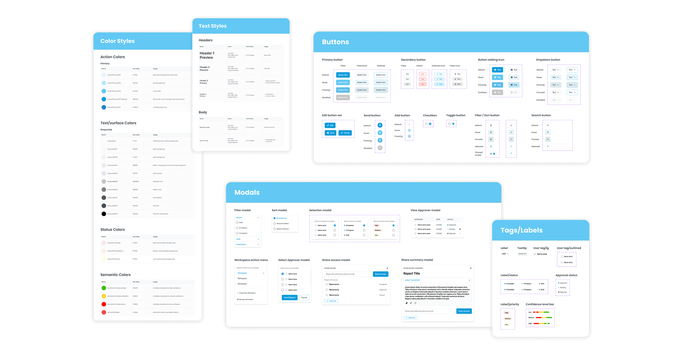
Timeline
Jan. - Apr. 2025
Tools
Figma, FigJam, shadcn/ui
My Role
Leading UX designer
(Capstone Proejct)
My Responsibilities
Design System, UI Audit, Component Design, Developer Handoff, Documentation, Iteration
When I joined, the platform was built entirely by engineers
— with no design guidelines, no visual standards, no foundation for scale.
So I built one. 🚀
Discovery & Audit
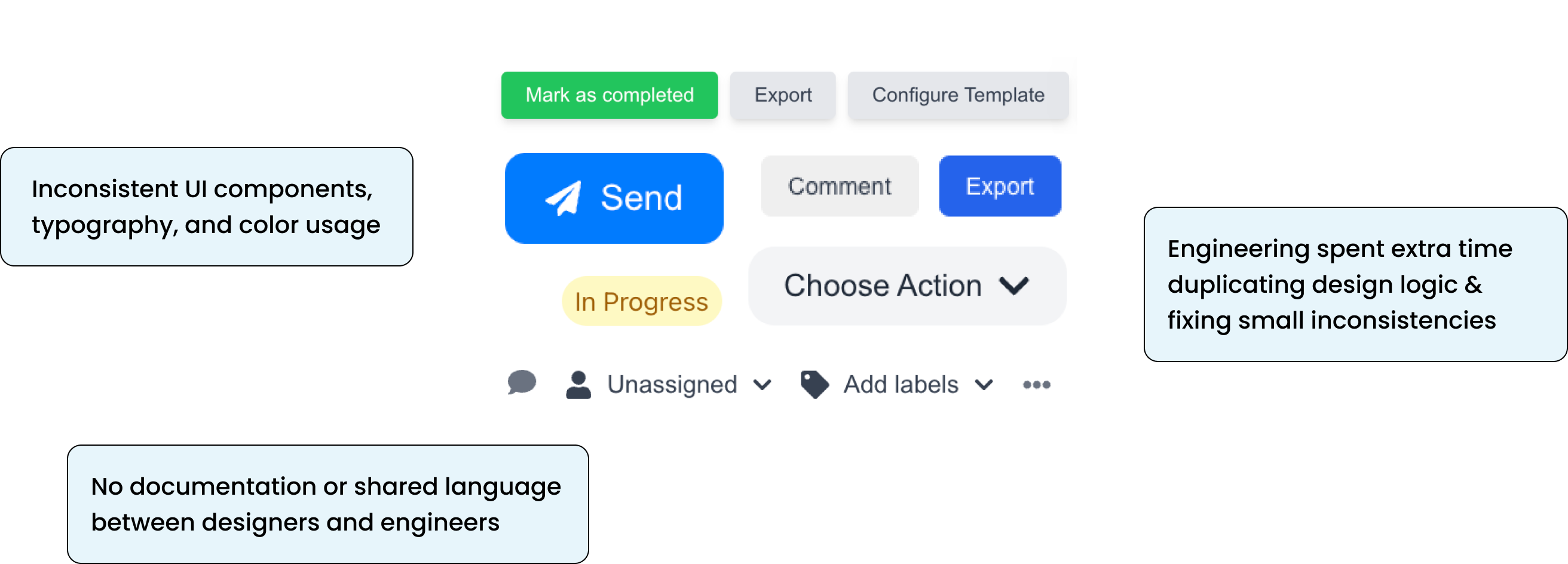
Before jumping into the actual design work, I was immediately struck by the lack of consistency and structure across the platform.
It became clear that the first priority should be establishing a solid foundation. To better understand the scope of the problem, I conducted a quick site audit and identified the following issues:
So how can I solve these problems and build an accessible design system for both designers and developers?
My Goal
I set out to create an accessible design system that would:
- Provide a foundation for consistency and scalability,
- Improve cross-functional collaboration,
- Accelerate product development.
Research — From Atoms to Systems
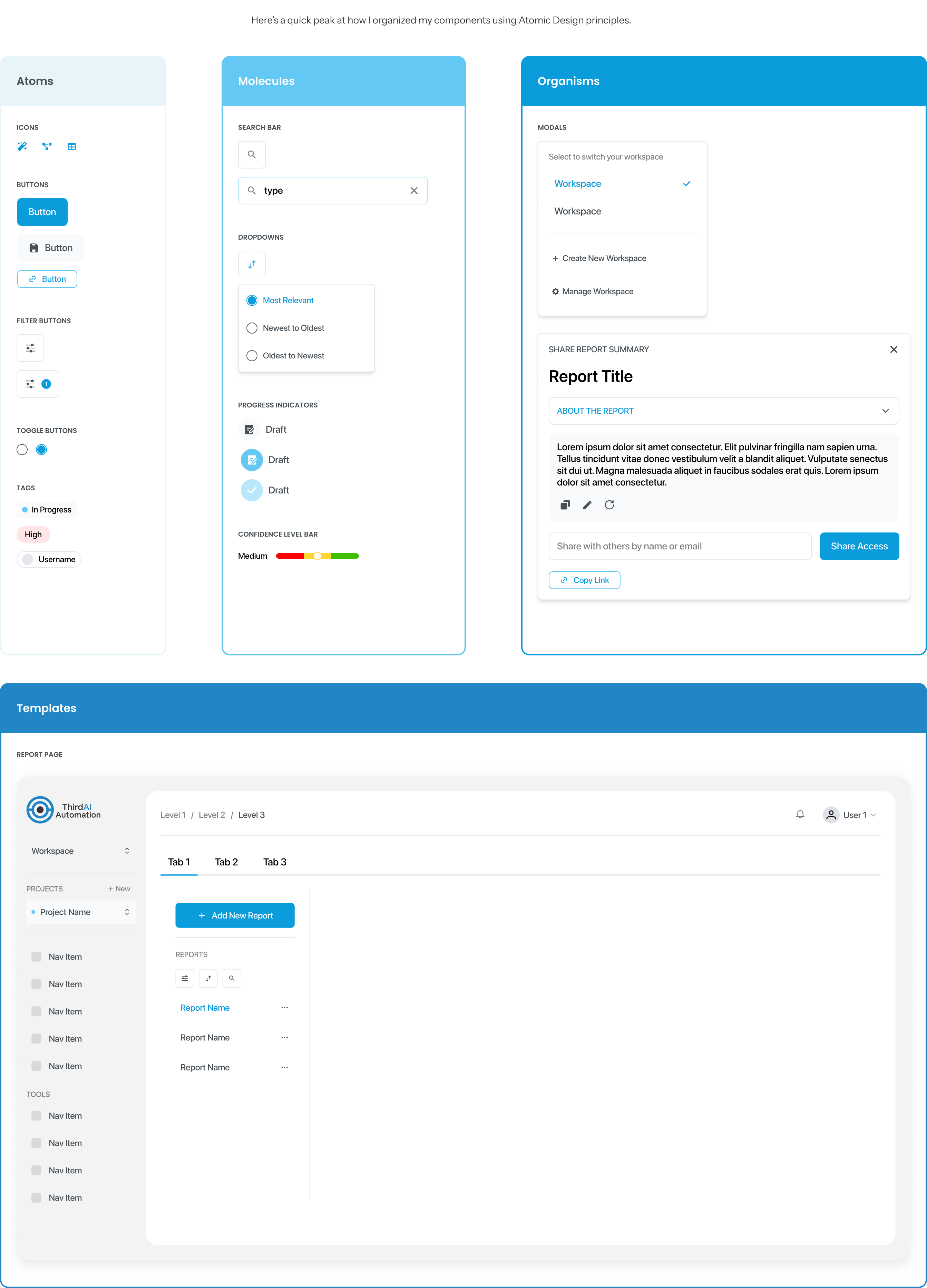
It was my first time building a design system from the ground up, and at first, I wasn’t sure where to begin. During my research, I came across the Atomic Design methodology, which gave me the structure I needed.
By breaking down interfaces into smaller, reusable building blocks within a modular hierarchy, I was able to think systematically about how to create consistency across the platform.
Define & Ideation
The Foundations
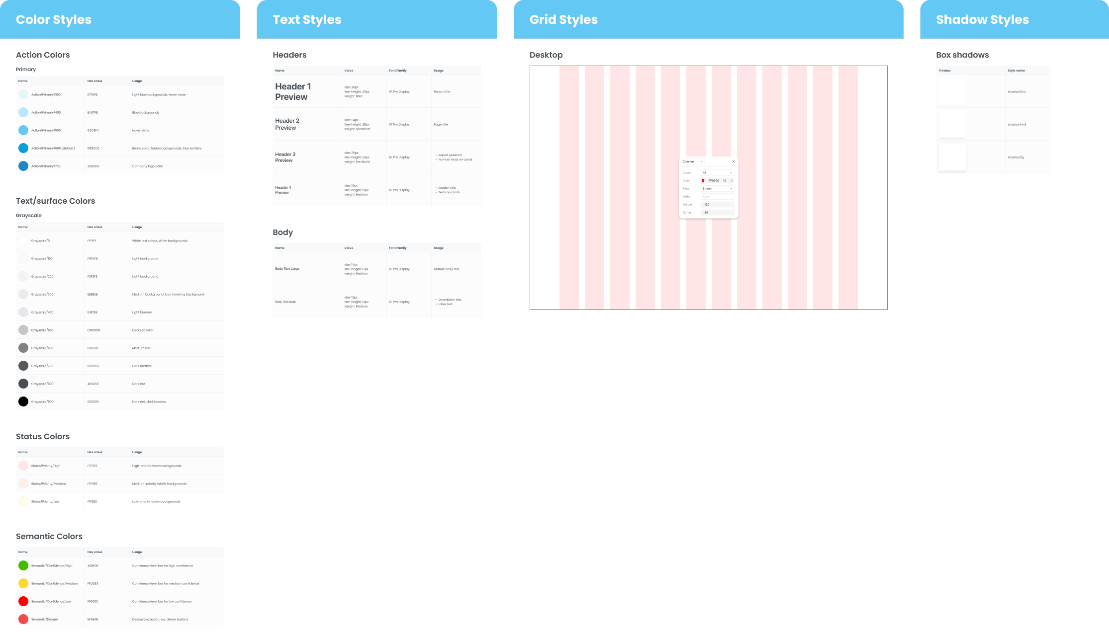
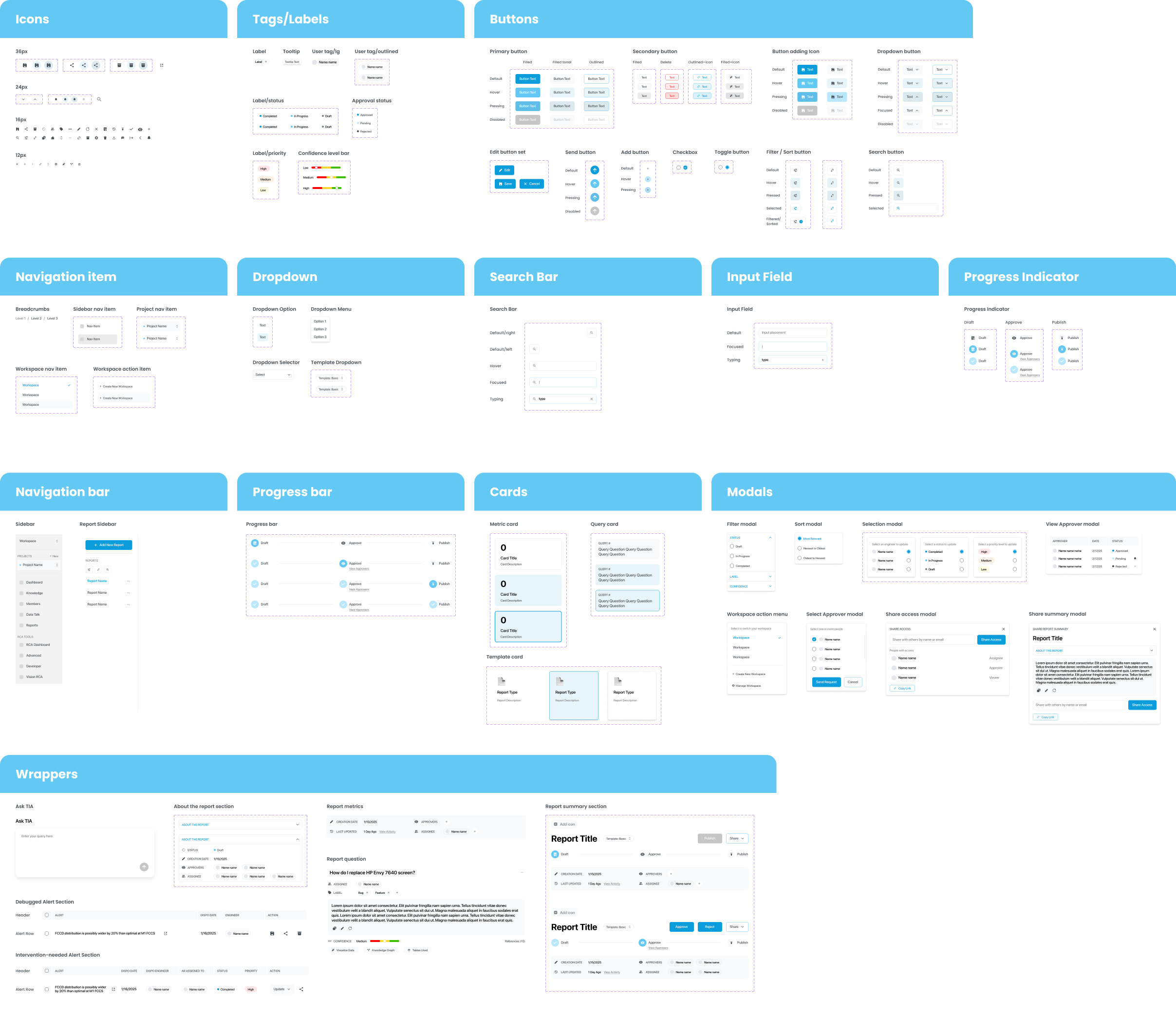
I started by defining the foundations—color tokens, typography scales, layout grids and shadow styles. These became the core elements that powered all future components and ensured that every piece of the interface spoke the same visual language.
The Components
To ensure the system is consistent and scalable in the future, I followed Atomic Design principles, built nested components, used component properties to simplify variants — and aligned my designs with shadcn/ui to streamline implementation.
Engineering-Aligned Design Decisions
1. Integrating with shadcn/ui
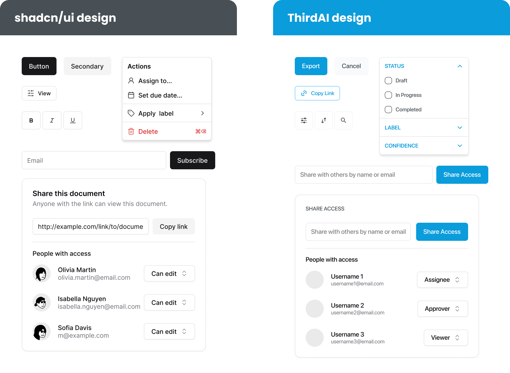
To ensure a smoother handoff and reduce implementation time, I proposed to incorporate shadcn/ui, an existing React component library, and aligned many components with it.
Instead of reinventing every component from scratch, I mapped my designs to existing shadcn elements where possible, then customized them to match our product needs, branding, and interaction patterns.
This approach allowed us to:
- Move faster in development
- Ensure design and code were speaking the same language
- Maintain flexibility to scale or override when needed
2. Designing for Dark Mode
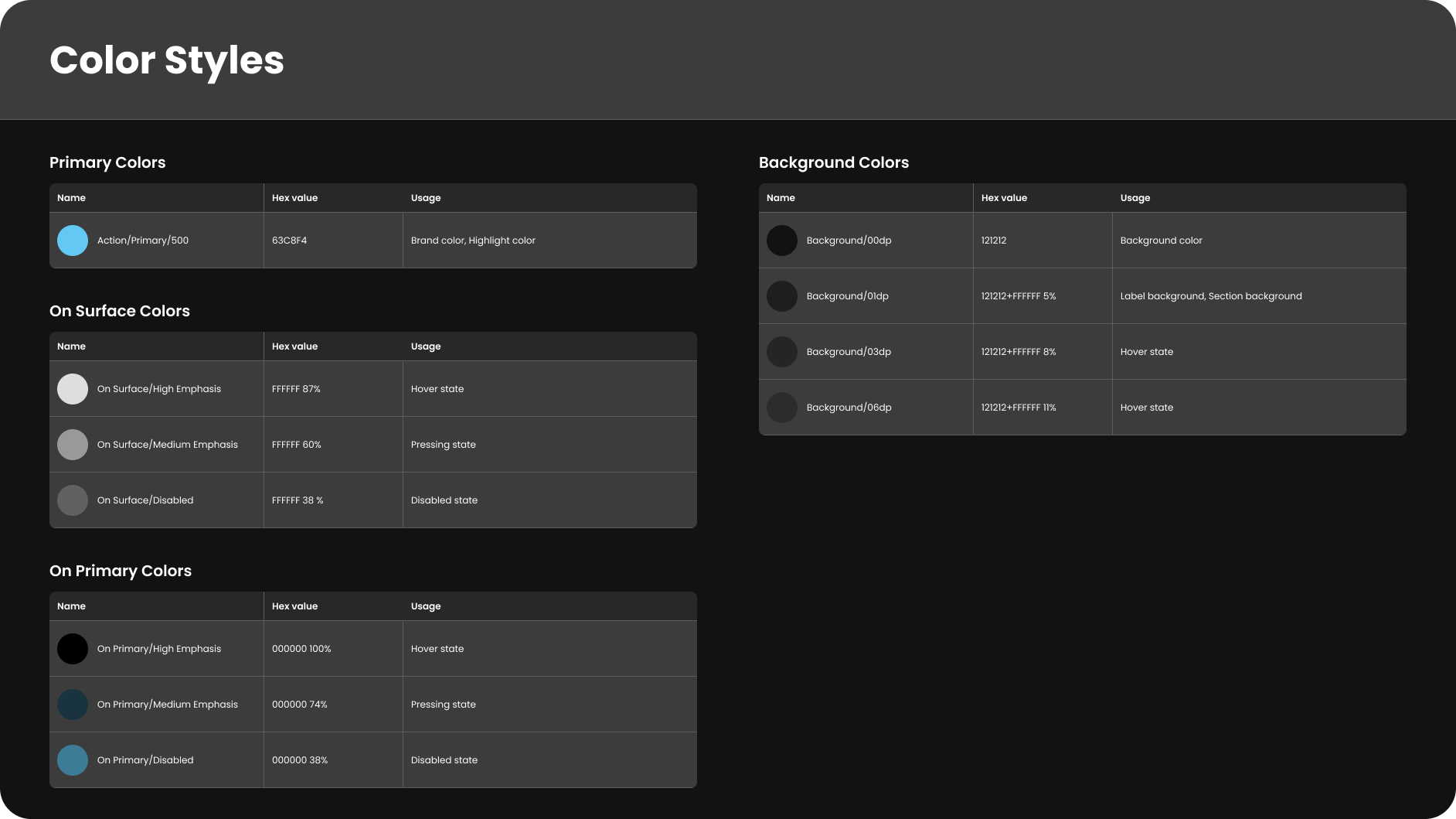
To support future dark mode without slowing down development, I focused on building a scalable color system with semantic tokens. This allowed engineers to apply dark theme styles directly in code, balancing delivery speed with long-term design consistency.
After Implementing The Design System
💼 Impact on the Team
- Sped up development with reusable components
- Reduced friction during design handoff
- Improved communication between design and engineering
👤 Impact on Users
- More consistent experience across the platform
- Clearer and more predictable UI patterns
- Foundation for future scalability and dark mode
🎉 Ultimately, the design system empowered both the team and the product to move faster with more confidence and clarity!
Scroll to top
Building and Scaling a Design System
A flexible and accessible design system that brings consistency, structure and alignment to fast-growing product
@ThirdAI Automation

Timeline
Jan. - Apr. 2025
Tools
Figma, FigJam, shadcn/ui
My Role
Leading UX designer
(Capstone Proejct)
My Responsibilities
Design System, UI Audit, Component Design, Developer Handoff, Documentation, Iteration
When I joined, the platform was built entirely by engineers
— with no design guidelines, no visual standards, no foundation for scale.
So I built one. 🚀
Discovery & Audit
Before jumping into the actual design work, I was immediately struck by the lack of consistency and structure across the platform.
It became clear that the first priority should be establishing a solid foundation. To better understand the scope of the problem, I conducted a quick site audit and identified the following issues:

So how can I solve these problems and build an accessible design system for both designers and developers?
My Goal
I set out to create an accessible design system that would:
- Provide a foundation for consistency and scalability,
- Improve cross-functional collaboration,
- Accelerate product development.
Research — From Atoms to Systems
It was my first time building a design system from the ground up, and at first, I wasn’t sure where to begin. During my research, I came across the Atomic Design methodology, which gave me the structure I needed.
By breaking down interfaces into smaller, reusable building blocks within a modular hierarchy, I was able to think systematically about how to create consistency across the platform.

Define & Ideation
The Foundations
I started by defining the foundations—color tokens, typography scales, layout grids and shadow styles. These became the core elements that powered all future components and ensured that every piece of the interface spoke the same visual language.

The Components
To ensure the system is consistent and scalable in the future, I followed Atomic Design principles, built nested components, used component properties to simplify variants — and aligned my designs with shadcn/ui to streamline implementation.

Engineering-Aligned Design Decisions
1. Integrating with shadcn/ui
To ensure a smoother handoff and reduce implementation time, I proposed to incorporate shadcn/ui, an existing React component library, and aligned many components with it.
Instead of reinventing every component from scratch, I mapped my designs to existing shadcn elements where possible, then customized them to match our product needs, branding, and interaction patterns.
This approach allowed us to:
- Move faster in development
- Ensure design and code were speaking the same language
- Maintain flexibility to scale or override when needed

2. Designing for Dark Mode
To support future dark mode without slowing down development, I focused on building a scalable color system with semantic tokens. This allowed engineers to apply dark theme styles directly in code, balancing delivery speed with long-term design consistency.

After Implementing The Design System
💼 Impact on the Team
- Sped up development with reusable components
- Reduced friction during design handoff
- Improved communication between design and engineering
👤 Impact on Users
- More consistent experience across the platform
- Clearer and more predictable UI patterns
- Foundation for future scalability and dark mode
🎉 Ultimately, the design system empowered both the team and the product to move faster with more confidence and clarity!
Scroll to top
Building and Scaling a Design System
A flexible and accessible design system that brings consistency, structure and alignment to fast-growing product
@ThirdAI Automation

Timeline
Jan. - Apr. 2025
Tools
Figma, FigJam, shadcn/ui
My Role
Leading UX designer
(Capstone Proejct)
My Responsibilities
Design System, UI Audit, Component Design, Developer Handoff, Documentation, Iteration
When I joined, the platform was built entirely by engineers
— with no design guidelines, no visual standards, no foundation for scale.
So I built one. 🚀
Discovery & Audit
Before jumping into the actual design work, I was immediately struck by the lack of consistency and structure across the platform.
It became clear that the first priority should be establishing a solid foundation. To better understand the scope of the problem, I conducted a quick site audit and identified the following issues:

So how can I solve these problems and build an accessible design system for both designers and developers?
My Goal
I set out to create an accessible design system that would:
- Provide a foundation for consistency and scalability,
- Improve cross-functional collaboration,
- Accelerate product development.
Research — From Atoms to Systems
It was my first time building a design system from the ground up, and at first, I wasn’t sure where to begin. During my research, I came across the Atomic Design methodology, which gave me the structure I needed.
By breaking down interfaces into smaller, reusable building blocks within a modular hierarchy, I was able to think systematically about how to create consistency across the platform.

Define & Ideation
The Foundations
I started by defining the foundations—color tokens, typography scales, layout grids and shadow styles. These became the core elements that powered all future components and ensured that every piece of the interface spoke the same visual language.

The Components
To ensure the system is consistent and scalable in the future, I followed Atomic Design principles, built nested components, used component properties to simplify variants — and aligned my designs with shadcn/ui to streamline implementation.

Engineering-Aligned Design Decisions
1. Integrating with shadcn/ui
To ensure a smoother handoff and reduce implementation time, I proposed to incorporate shadcn/ui, an existing React component library, and aligned many components with it.
Instead of reinventing every component from scratch, I mapped my designs to existing shadcn elements where possible, then customized them to match our product needs, branding, and interaction patterns.
This approach allowed us to:
- Move faster in development
- Ensure design and code were speaking the same language
- Maintain flexibility to scale or override when needed

2. Designing for Dark Mode
To support future dark mode without slowing down development, I focused on building a scalable color system with semantic tokens. This allowed engineers to apply dark theme styles directly in code, balancing delivery speed with long-term design consistency.

After Implementing The Design System
💼 Impact on the Team
- Sped up development with reusable components
- Reduced friction during design handoff
- Improved communication between design and engineering
👤 Impact on Users
- More consistent experience across the platform
- Clearer and more predictable UI patterns
- Foundation for future scalability and dark mode
🎉 Ultimately, the design system empowered both the team and the product to move faster with more confidence and clarity!
Scroll to top